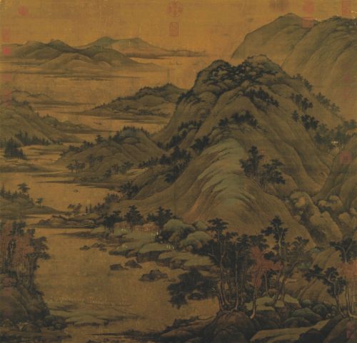
Gerhard Richter (b. 1932), Vierwaldstätter See (Lake Lucerne) detail. Oil on canvas, 120 x 150 cm Executed in 1969 Estimate on Request © Christie’s Images Ltd. 2015.
LONDON.- In February 2015, Christie’s will offer another outstanding week of auctions led by Gerhard Richter’s Vierwaldstätter See (Lake Lucerne), 1969, a sublime photo-painting of the famous Swiss Lake, held in the same private collection since 1973, which is presented during the Evening Auction in London on 11 February. Following the world record price of $69.6million achieved for Cy Twombly’s Untitled in November, the Evening Auction also includes Untitled (New York City), 1970, a mesmerising large-scale work from the same seminal series of ‘blackboard’ paintings. The week will also feature a selection of art donated by former students of Goldsmiths, University of London to benefit the building of a new gallery to be offered during our Day sale on 12 February.
Second highest pre-sale low estimate in Europe
This season offers the second highest, pre-sale low estimate for any Post-War & Contemporary Art Evening Auction ever to take place in Europe at £95million (64 lots). The record Post War and Contemporary Art Evening auction in Europe was held by Christie’s in June 2012, and realised £132 million against a low pre-sale estimate of £102 million. Last year’s equivalent February season at Christies broke the record for any Post War and Contemporary Art week in Europe when it realised £176 million, including the benchmark sale of Arte Povera and Post-War Italian art, Eyes Wide Open: an Italian Vision, which realised a total of £38million.
GERHARD RICHTER’S SWISS LAKE
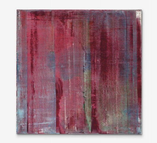
The Post-War and Contemporary Evening Auction is led by Gerhard Richter’s Vierwaldstätter See (Lake Lucerne) (estimate on request). The painting is the largest of a distinct series of four views of the famous Swiss lake painted by Richter in 1969. Purchased from the artist by the present owner in 1973 after its inclusion in the Grand Art Exhibition at the Haus der Kunst Munich, it stems from a landmark period in Richter’s early oeuvre. Three further works by Gerhard Richter are also included in the auction spanning three decades of his celebrated practice: Karmin (Carmine), 1994 (estimate: £9,000,000 – 14,000,000), Abstraktes Bild, 1986 (estimate: £1,000,000 – 1,500,000), Abstraktes Bild, 1990 (estimate: £3,500,000 – 4,500,000).

Gerhard Richter (B. 1932), Vierwaldstätter See (Lake Lucerne), signed, numbered and dated ‘226/2 Richter 69’ (on the reverse), oil on canvas, 47¼ x 59¼in. (120 x 150cm.). Painted in 1969. Estimate Upon Request. © Christie’s Images Ltd. 2015.
Provenance: The Artist.
Acquired from the above by the present owner in 1973.
Property from a Distinguished European Collection
Literature: XXXVI Biennale Internationale dell’Arte, German Pavilion, exh. cat., Venice 1972, p. 41 ( incorrectly referenced as no. 226-1; illustrated, p. 68).
J. Harten (ed.) and D. Elger, Gerhard Richter: Bilder 1962-1985, exh. cat., Dusseldorf, Städtische Kunsthalle Düsseldorf, 1986, p. 374 (incorrectly referenced as no. 226-1; illustrated, p. 102).
Kunst- und Ausstellungshalle der Bundesrepublik Deutschland (ed.), Gerhard Richter, Werkübersicht/Catalogue Raisonné: 1962-1993, vol. III, Ostfildern-Ruit 1993, p. 158 (incorrectly referenced as no. 226-1; illustrated, unpaged).
H. Friedel (ed.), Gerhard Richter: Atlas, Cologne 2006, p. 853.
D. Elger (ed.), Gerhard Richter. Landschaften, Ostfildern-Ruit 2011, p. 174 (incorrectly referenced as no. 226-1; illustrated in colour, p. 40).
Exhibited: Munich, Haus der Kunst, Große Kunst Ausstellung, Landschaft. Figur und Objekt in der Landschaft, 1973, no. 884 (illustrated, p. 290).
This work will be included in the forthcoming 2nd volume of the Gerhard Richter. Catalogue raisonné, edited by Dietmar Elger, under cat. no. 226-2.
Notes: ‘Just because landscape is beautiful. It’s probably the most terrific thing there is… I felt like painting something beautiful’ (Richter, Interview with Rolf Gunther Dienst, 1970, quoted in Gerhard Richter: The Daily Practice of Painting. Writings and Interviews 1962-1993, ed. Hans-Ulrich Obrist, trans. David Britt, London, 1995, pp.63-64).
‘Of course, my landscapes are not only beautiful or nostalgic, with a Romantic or classical suggestion of lost Paradises, but above all “untruthful” (even if I did not always find a way of showing it); and by “untruthful” I mean the glorifying way we look at Nature – Nature, which in all its forms is always against us, because it knows no meaning, no pity, no sympathy, because it knows nothing and is absolutely mindless: the total antithesis of ourselves, absolutely inhuman. Every beauty that we see in landscape – every enchanting colour effect, or tranquil scene, or powerful atmosphere, every gentle linearity or magnificent spatial depth or whatever is a our projection; and we can switch it off at a moment’s notice’’ (G. Richter, 1986, quoted in H.-U. Obrist (ed.), Gerhard Richter: The Daily Practice of Painting. Writings and Interviews 1962-1993, trans. D. Britt, London, 1995, p. 124).
‘A painting by Caspar David Friedrich is not a thing of the past. What is past is only the set of circumstances that allowed it to be painted: specific ideologies, for example. Beyond that, if it is any “good”, it concerns us – transcending ideology – as art that we consider worth the trouble of defending (perceiving, showing, making). It is therefore quite possible to paint like Caspar David Friedrich today’ G. Richter, quoted in D. Elger (ed.), Gerhard Richter Landscapes, exh. cat., Sprengel Museum Hannover, 1998, p. 12).
‘Their significance lies, not in a critical mass but in the prominent position they occupy in the artist’s oeuvre, and in how he thrusts them into dialog with the other work. In several scenes- conceptual, aesthetic, and technical- they would serve as a bridge from the photo-paintings to the abstract paintings soon to come’ (D. Elger, Gerhard Richter: A Life in Painting, Chicago 2009, p. 173).
‘I don’t mistrust reality of which I know next to nothing. I mistrust our model of reality conveyed to us by our senses, which is imperfect and circumscribed’ G. Richter in an interview with Rolf Schön, 1972, reprinted in: H.-U. Obrist (ed.), Gerhard Richter. The Daily Practice of Painting, London 1995, p.73).
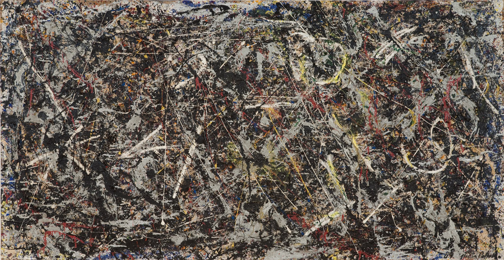
A sublime vista at the confluence of two headlands in the middle of Lake Lucerne, Vierwaldstätter See is the largest of a distinct series of four views of the lake painted by Richter in 1969. Purchased by the present owner in 1973 from the artist after the work was included in the Grand Art Exhibition held in the Haus der Kunst Munich, the work represents a landmark period in Richter’s oeuvre. During the early to mid 1960s Richter had made his name with his black and white photo-paintings, which fell under the early aegis of German Pop Art, but it was in the years between 1967-1970 that the full expanse of his vision would be unveiled in an unprecedented period of creativity in which all forms of style in painting from Abstract to Figurative, Minimalist to Constructive were explored and amalgamated with equal technical virtuosity and aplomb. Balancing the composition on the knife-edge between figuration and abstraction,Vierwaldstätter See in many ways prefigures the seminal series of seascapes completed in 1969-70, and the two series together can be seen to represent the concepts which run throughout his oeuvre to today. Faced with the panorama, the viewer’s eye is carried along the passage of softened, almost smoky clouds, around the darkened headland onto a distant and illusive horizon, at once inviting the viewer into the landscape whilst at the same time rendering a view that is entirely unobtainable. As Robert Storr states ‘the viewer is thus left in a state of perpetual limbo bracketed by exigent pleasures and an understated but unshakable nihilism. Those who approach Richter’s landscapes with a yearning for the exotic or the pastoral are greeted by images that first intensify that desire and then deflect it’ (R. Storr (ed.),Gerhard Richter: Forty Years of Painting, exh. cat., Museum of Modern Art, New York, 2002, pp. 65-66). Meticulously painted, with feathered brushstrokes deliberately visible as evidence of Richter’s process, Vierwaldstätter See acts as a precursor to the sweep of the squeegee which would later define his abstract works. Emerging through the delicate brushstrokes, layers of midnight blue deepen Richter’s grisaille palette and create an intense surface that radiates with enduring natural beauty.
One of the largest lakes in Switzerland, Lake Lucerne has an elusive set of contours that has continued to inspire painters through the ages most notably J.M.W. Turner paintings of the Rigi. For this painting Richter appears to have chosen a view from Vitznau, through the narrow strait at the centre of the lake, between the two rocky promontories called respectively Untere and Obere Nase. Within this apparently photo-real view Richter has conjured an extraordinary atmosphere that dissolves in and out of focus with an ambient haze that creates an almost ethereal environment, recognisably Lake Lucerne yet eluding any exact detail or location. Frequently returning to Switzerland throughout his life, Richter’s landscape is a poetic representation of a well-loved destination. Playing with the conventions of the romantic sublime, Richter in Vierwaldstätter See simultaneously and emphatically refutes the historicized associations of landscape painting, redefining humanity’s role within, and in relation to, nature.
1960S – REVOLUTIONARY YEARS
Painted in 1969, Vierwaldstätter See emerges from a deeply creative moment in the artist’s career and it was in this year that the sheer multiplicity of Richter’s practice became apparent to the public. In his first solo show in a public institution at the Gegenverkehr e.V. in Aachen in 1969, Richter displayed his new forays into abstraction alongside landscape and figurative works based on photographic sources. Included in this show were early photo paintings such as Falbarer Trockner (Folding Dryer) (1962), colour charts such as 192 Farben (192 colours) 1966 and abstracted townscapes such as Stadtbild Paris 1968. Deliberately hung without any sense of chronology or theme, in many respects mirroring his own indifference to the conventional matters of style and subject, this show demonstrated the multiplicity of Richter’s practice in these fertile years.
In 1969, Richter moved away from the straightforward photo paintings of his earlier years. Developing the way in which he initially obfuscated the photographic image, by 1969 Richter demonstrated a far more nuanced and skillful approach to his continued investigation of representation, figuration and abstraction. As part of this process Richter embarked on an experimental series of landscapes. Varying in scenery and painting techniques, the first were loose painterly explorations of aerial photographs of cities and townscapes and later, mountain landscapes and park scenes with their hard-edge textured paint surfaces. In the months leading up to the creation of Vierwaldstätter See Richter produced a series of Swiss Alpine landscapes. With their crisp detail these works are a radical counterpoint to his later interpretations of the alpine landscape visible in Vierwaldstätter See. In this respect Vierwaldstätter See with its more mature, almost luxurious surface, can be seen to resonate more closely with his romanticized, nearly abstract, seascapes that Richter went on to paint towards the end of 1969 and through to 1970.
THE LANDSCAPE EMBODIED IN A BRUSHSTROKE
The artist’s facility with his medium and his technical skill mark the Vierwaldstätter See series and the seascapes of this period as some of his most accomplished and conceptually innovative. The rich, almost velvet surface ofVierwaldstätter See and depth it provides to the composition, shows the development in Richter’s style away from the German pop photo paintings of the early 1960s. This technical ability meant that at the same time as evoking German Romanticism, Richter managed to create paintings that were entirely radical, standing as subtle and subversive responses to tradition. Vierwaldstätter See appears to have been brilliantly captured in movement, the artist visualising the image as if from the window of a passing car or airplane. The sense of transience, of a view captured in a fleeting moment, reiterates our own alienation from nature.
In carrying out the composition, Richter has manipulated the surface of the paint by dragging a dry brush across the canvas while the paint is still wet. This ultra-fne horizontal brushwork creates a hypnotic effect which becomes more apparent as you approach the canvas, with each individual brushstroke becoming visible as an individual element of a coherent whole. Stepping back from the work allows these elements to melt away revealing the softened edges of the lake’s surface. The edges are blurred to the point of abstraction such that the waterline and the dramatic mountainous shore blur in the delicate featherlike brushstrokes and subtle chromatic variation. Richter’s emphatic focus on the brushstroke renders a complex, almost luxurious surface. Areas of gloss mark the physical surface of the lake’s shoreline which has so often inspired painters throughout history.
Richter’s unique painting method strengthens the tension and ambivalence between painting and photography, abstraction and reality. The photographic source is skillfully recreated whilst at the same time brushstrokes marks remain visible, posing a constant question of the viewer as to the nature of the image they are faced with. The subtle blurring of the image is a deliberate strategy in Richter’s photo paintings as a means of creating distance between the viewer and the representation of nature, emphasizing that neither painting, nor photography, can bridge the gap between reality and experience.
THE ROMANTIC SUBLIME
For Richter, his early landscapes represented a determined departure from the politicized painting and the avant-gardism of the late 1960s. As he explained, ‘just because landscape is beautiful, it’s probably the most terrific thing there is…I felt like painting something beautiful’ (G. Richter quoted in R. Storr (ed.), Gerhard Richter: Forty Years of Painting, exh. cat., Museum of Modern Art, New York, 2002, pp. 65-66). In this departure from the contemporary tides in painting, Richter was engaging with the legacy of eighteenth and nineteenth century German Romanticism and asserting his right to create art that addressed any subject matter or artistic tradition. Through this assertion works like Vierwaldstätter See demonstrate the artist’s continued efforts to salvage painting as a medium, skillfully depicting the sublime through delicate layers of paint. The subtle fusion between the painted image and the reality of the landscape ultimately mean that Richter’s landscape paintings possess the same conceptual nuances that unite much of the artist’s oeuvre.
We can particularly see the affinity between Vierwaldstätter See and the dramatic mountain landscapes of Caspar David Friedrich, and rightly a comparison is frequently made between the two artists. As Elger notes, when Richter was still an art student in the GDR, he used to travel to Dahlem to visit the museums and always took time to view the paintings by Friedrich. Richter has himself commented on this legacy, affirming the German romantic influence. As the artist explained, ‘a painting by Caspar David Friedrich is not a thing of the past. What is past is only the set of circumstances that allowed it to be painted: specific ideologies, for example. Beyond that, if it is any “good”, it concerns us – transcending ideology – as art that we consider worth the trouble of defending (perceiving, showing, making). It is therefore quite possible to paint like Caspar David Friedrich today’ (G. Richter, quoted in D. Elger (ed.), Gerhard Richter Landscapes, exh. cat., Sprengel Museum Hannover, 1998, p. 12).
Nevertheless, while Richter was clearly channeling the visual language of Friedrich’s paintings, his intentions were far more complex and subversive. Vierwaldstätter See is deliberately imbued with the Romantic connection through its sense of distance and expanse, yet with one key difference. Whereas Romantic paintings often meet the viewer halfway, usually by means of a surrogate figure in the landscape such as the turned figure in The Monk by the Sea, Richter’s landscapes in contrast remain uninhabited. In this way Richter dramatically redefines the historicized understanding of humanity’s role in nature. In Vierwaldstätter See Richter invites the viewer to gaze upon the unmediated beauty of the sublime landscape without ever making contact, remaining forever frustrated by its intangibility.
For Richter, all nature is fundamentally outside the human purview and beyond any religious claims. As Richter has said of his landscapes, ‘[they] are not only beautiful or nostalgic, with a Romantic or classical suggestion of lost Paradises, but above all ‘untruthful’… and by “untruthful” I mean the glorifying way we look at Nature – Nature, which in all its forms is always against us because it knows no meaning, no pity, no sympathy, because it knows nothing and is absolutely inhuman’. (G. Richter, quoted in J. Nestegrad (ed.), Gerhard Richter: The Art of the Impossible – Paintings 1964-1998, Oslo 1999). By this means Richter used his landscape paintings as ‘visual models of a lost truth’ and thus they can be seen directly to complement his abstract works which he has described as ‘fictive models’ (D. Elger, Gerhard Richter Landscapes, exh cat., Sprengel Museum, Hannover, 1998, p. 21). Richter himself has stated ‘For me there is no difference between a landscape and an abstract painting. In my opinion the term “realism” makes no sense’ (G. Richter, quoted in D. Elger, Gerhard Richter: A Life in Painting, Chicago 2009, p. 273).
LAKE LUCERNE
In his efforts to salvage painting, examining the way in which it had become seemingly obsolete in the age of the photograph, it is of no coincidence that Richter was drawn to the vivid landscapes of the great Swiss lakes, in particular Lake Lucerne. The dramatic, awe inspiring mountains, combined with the lake’s placid surface gave rise to an inspirational moment for many artists, including Alexandre Calame, Albert Bierstadt, John Ruskin and most notably J.M.W. Turner. For Turner, the Swiss lakes inspired a series of works which embody the tradition of the romantic sublime. Like many artists before him, Turner initially headed south in search of light and in 1819 travelled to Italy, later visiting Switzerland in the 1840s where he was captivated by the sublime beauty of the mountain landscape. In many ways this can be seen to resonate with Richter’s own travels in 1969, beginning further south in Corsica where the study of light dominates his works, and then later to Switzerland where he seems to have encountered the same sense of awe and sublime as Turner did over a century before him.
ATLAS: THROUGH THE ARTIST’S LENS
It was also in 1969 that Richter first began to compile his photographic source material, known now as Atlas that would soon become a referential touchstone throughout his career. This ever-growing subjective anthology of photos, some found by and others taken by Richter, was first exhibited in 1970 under the title Studies 1965-1970 at the Museum Folkwang in Essen, and later would be formally exhibited under the Atlas title in 1972 in Utrecht. Since these early years Richter has added to and exhibited this shifting, swelling flow of source material, such that it stands as a fascinating counterpoint to his paintings.
Although Richter only began to compile Atlas in 1969, his use of photographs as his source material began in 1962 when no longer satisfied with his earlier abstract work he turned to paintings based on found photographs. In doing so, Richter was looking for a new means of painting, ‘free from “literary effect”, historical bias and the decorum of traditional composition’ (D. Elger, Gerhard Richter: A Life in Painting, Chicago 2009, p. 49). Appearing initially as a European response to the American Pop Art movement, the artist began by mining images from newspapers, books and other published materials, rendering them in cool, painted monochrome. Richter surmised that working from a photo in this way was the perfect means of escape: ‘a photograph – unless the art photographers have ‘fashioned’ it is simply the best picture I can imagine… it is a perfect; it does not change; it is absolute, and therefore autonomous and unconditional… This is something that just has to be incorporated into painting’ (G. Richter, quoted in D. Elger,Gerhard Richter: A Life in Painting, Chicago 2009, p. 49). It was not until 1968 that Richter began to use his own photographs, collecting colour pictures of his first holiday abroad with his family to Corsica.
Building on these earlier photopaintings, Richter’s first colour investigations of the natural landscape began in 1968, just one year before he created Vierwaldstätter See. Buoyed by his recent exhibition success, his recent appointment to professorship at Hamburg Art Academy and birth of his daughter Betty, Richter travelled to Corsica on his first real family vacation. Armed with his camera, he captured numerous rolls of film, which he later translated into paintings. These works contain the same wide, open horizon trailing into the distance and low, dramatic sky as is captured inVierwaldstätter See, simultaneously invoking and puncturing both abstraction and also Romanticism.
REALITY AND REPRESENTATION
Vierwaldstätter See is a masterful rendition of a Swiss alpine vista that vibrates with references to the Romantic tradition so beloved in Germany. Low clouds nestle between brooding headlands in a dramatic swirl of grey and midnight blue, with a hazy sense of the vast distance in the horizon which intentionally raises the romantic notion of the sublime. It is a masterful study of light and landscape, tone and form. Delicate feathered brushstrokes evoking a photographic source, create an intense illusion of reality, but one that is distant and elusive, that nature can never fulfill. Executed at the end of the 1960s, Vierwaldstätter See comes from an intensely creative moment in Richter’s career when he was investigating for the first time the unities between abstract and figurative painting. As the artist once said, ‘if the Abstract paintings show my reality, then the landscapes and still-lives show my yearning… though these pictures are motivated by the dream of classical order and a pristine world – by nostalgia in other words – the anachronism in them takes on a subversive and contemporary quality’ (G. Richter, quoted in A. Zweite (ed.), Gerhard Richter: Catalogue Raisonné 1993-2004, Dusseldorf 2005, p. 33).

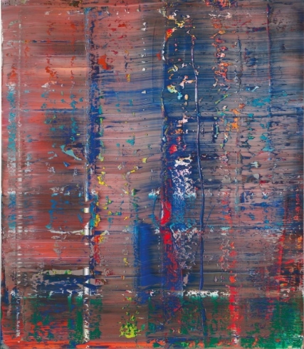
Gerhard Richter (b. 1932), Karmin (Carmine), signed, numbered and dated ‘Richter 1994 810-1’ (on the reverse), oil on canvas, 78¾ x 78¾in. (200 x 200cm.).Painted in 1994. Estimate £9,000,000 – £14,000,000 ($13,617,000 – $21,182,000). © Christie’s Images Ltd. 2015.
Provenance: Anthony d’Offay Gallery, London.
Lord Anthony Jacobs, London.
Gagosian Gallery, London.
Acquired from the above by the present owner in 2010.
Property from a Distinguished European Collection
Literature: Gerhard Richter 1998, exh. cat., London, Anthony d’Offay Gallery, 1998, no. 810-1 (illustrated in colour, p. 89).
Gerhard Richter Werkverzeichnis 1993-2004, exh. cat., Dusseldorf, K20 Kunstsammlung Nordrhein-Westfalen, 2005, p. 309, no. 810-1 (illustrated in colour, p. 271).
Exhibited: London, Anthony d’ Offay Gallery, Gerhard Richter: Painting in the Nineties, 1995, no. 19 (illustrated in colour, pp. 53 and 84).
Notes: ‘Almost all the abstract paintings show scenarios, surroundings and landscapes that don’t exist, but they create the impression that they could exist. As though they were photographs of scenarios and regions that had never yet been seen’ (G. Richter, quoted in ‘I Have Nothing to Say and I’m Saying It: Conversation between Gerhard Richter and Nicholas Serota ‘, in Gerhard Richter: Panorama, exh. cat., London, 2011, p. 19).
‘Richter has taken to faying the painted skin of his canvases with a spatula in broad strokes or long, wavering stripes leaving behind abraded, shimmering surfaces that at their sheerest and most luminous look like the Aurora Borealis suspended above various red, orange, yellow, green, blue or violet planets’ (R. Storr, Gerhard Richter: Forty Years of Painting, exh. cat., Museum of Modern Art, New York, 2002, p. 81).
‘Abstract paintings are fictitious models because they visualize a reality, which we can neither see nor describe, but which we may nevertheless conclude exists. We attach negative names to this reality; the un-known, the un-graspable, the infinite, and for thousands of years we have depicted it in terms of substitute images live heaven and hell, gods and devils. With abstract painting we create a better means of approaching what can be neither seen nor understood’ (G. Richter, quoted in R. Nasgaard, ‘Gerhard Richter’, Gerhard Richter: Paintings, exh. cat., Museum of Contemporary Art, Chicago, 1988, p. 107).
‘[In this period] Richter attempted to take possession of his domestic happiness through a long and painterly process, as if only this would make the situation believable’ (D. Elger, Gerhard Richter: A Life in Painting, Chicago 2009, p. 327).
Enshrouded in a luxurious velvety Carmine red veil, Karmin (Carmine) engulfs the viewer in its mysterious crimson glow. Like a luscious velvet curtain draped over a window, or rich cloth that cascades over the contours of a figure, this majestic painting tempts the viewer into its warm hearth with its enigmatic surface. In Karmin, Richter has become captivated by the rhythmic application and removal of paint in horizontal and vertical planes, each successive stroke of the squeegee drawing a veil across the previous layer of paint like a curtain, playing with the notion of presence and absence. Through addition and subtraction to the point of harmony, palimpsests of emerald green and azure blue emerge and dissolve through the apertures in the surface, offering glimpses of an imaginary landscape somewhere in the distance. Created in 1994, the painting reflects the supreme contentment of the artist. In 1991 Richter held his breakthrough exhibition at Tate Gallery, London and in 1993 he received a major touring retrospective Gerhard Richter: Malerei 1962-1993 curated by Kasper König accompanied by a three volume catalogue raisonné edited by Benjamin Buchloch. This latter exhibition containing 130 works carried out over the course of thirty years, was to entirely reinvent Richter’s career. As critic Doris von Drathen wrote shortly after, ‘there are exhibitions that, like great milestones, reset the standards in contemporary art. Richter’s retrospective, launching now at the ARC in Paris, is of this quality’ (D. von Drathen quoted in D. Elger, Gerhard Richter: A Life in Painting, Chicago 2009, p. 323). The beauty and balance of Karmin can be understood as a reflection of this personal satisfaction. Indeed a sense of his enriched emotional life is evident in the confident gestures, radiance and majestic palette of the painting. In 1994, whilst he was completing Karmin, Richter was also engaged in a series of paintings depicting his new wife Sabine Moritz. In particular the photorealist masterpiece, Lesende demonstrates a beautiful tenderness towards its subject, light illuminating Sabine’s elegant profile. The following year, Richter was to begin a suite of paintings entitled S. mit Kind, now housed in Hamburger Kunsthalle, Hamburg. Depicting Sabine cradling their young son Moritz in her arms, Richter has again removed vertical swathes of paint with the squeegee to in effect reveal the fgures from behind the front surface. As Dietmar Elger suggests, in this period ‘Richter attempted to take possession of his domestic happiness through a long and painterly process, as if only this would make the situation believable’ (G. Richter quoted in D. Elger,Gerhard Richter: A Life in Painting, Chicago 2009, p. 327). It was in 1995 that Karmin was exhibited for the frst time in Gerhard Richter: Painting in the Nineties at Anthony d’Offay Gallery; an acclaimed show including works that now reside in major museum collections such as Statens Museum for Kunst, Copenhagen, The Cleveland Museum of Art, Cleveland, Tate Modern, London, National Galleries of Scotland, Edinburgh, La Caixa Foundation, Barcelona and The National Museum of Modern Art, Tokyo.
Executed during the run of the touring retrospective described above, this intersection of horizontal and vertical strokes in a grid-like assembly, and the harmonious intermarriage of weton- wet oil paint, creates a near sublime effect that recalls Richter’s greatest cycle of abstracts, the Bach series (1992, Moderna Museet, Stockholm) which were premiered here for the first time. As Richter has described, In Karmin vast antecedent layers laid down in horizontal swathes are revealed and submerged in the artist’s subsequent painting. Through the horizontal strokes of paint, Richter has swept through the lustrous medium in vertical planes from top to bottom, in an act of creative destruction, partially obscuring and at the same time allowing jewel-like blues and greens to interact with velveteen reds at the centre of the composition. As Robert Storr has observed, ‘Richter has taken to faying the painted skin of his canvases with a spatula in broad strokes or long, wavering stripes leaving behind abraded, shimmering surfaces that at their sheerest and most luminous look like the Aurora Borealis suspended above various red, orange, yellow, green, blue or violet planets’ (R. Storr, Gerhard Richter: Forty Years of Painting, exh. cat., Museum of Modern Art, New York, 2002, p. 81).
In Karmin, Richter creates a work that celebrates the sensual pleasures of freely applied paint and colour, just as he accomplished in the Bach series. In addition to the rich optical experience of the painting, Richter encourages the viewer to immerse him or herself in the imaginary space of the composition. He insists that ‘paintings are always illusionistic’ so that a line, form or colour ‘is only interesting when it releases an interesting association’ (G. Richter quoted in R. Nasgaard, ‘Gerhard Richter’, Gerhard Richter: Paintings, exh. cat., Museum of Contemporary Art, Chicago 1988, p. 107). In Karmin the cumulative layers of non-representational paint in hues of red, green and blue, cannot help but evoke the English rose garden or a Mediterranean sunset, offering a romantic window onto the world. Just as Claude Monet had done generations before him in his Nymphéas, Richter beautifully illuminates the shifting boundary between figuration and abstraction. Whilst Monet’s immersive, shimmering images of waterlilies and reflections on the quicksilver water of the pond at Giverny pushed figuration to the brink of abstraction, emphasising the illusory aspect of the lush, textured paint itself, in Karmin Richter has arrived at the same effect through different means.
For Richter, his free abstraction is the product of a long investigation into the possibilities of painting spanning more than five decades. Coming full-circle from his early Tisch (1962) in which he cancelled his photorealist image with haptic swirls of grey paint, Richter began in the 1980s to freely overlay his canvases with colourful streaks and drags of pigment using his signature squeegee. As Dietmar Elger has observed, ‘for Richter, the squeegee is the most important implement for integrating coincidence into his art. For years, he used it sparingly, but he came to appreciate how the structure of paint applied with a squeegee can never be completely controlled. It thus introduces a moment of surprise that often enables him to extricate himself from a creative dead-end, destroying a prior, unsatisfactory effort and opening the door to a fresh start’ (G. Richter quoted in D. Elger, Gerhard Richter: A Life in Painting, Chicago 2009, p. 251). This method was to find its purest articulation between 1989 and 1994 with large-format paintings such asKarmin. Deconstructing the relationship between figure and ground, Richter was embracing the contingency of his medium, enjoying the effects of the spontaneous yet confident application of paint. As he once explained, ‘it is a good technique for switching off thinking consciously, I can’t calculate the result. But subconsciously, I can sense it. This is a nice ‘between’ state’ (G. Richter quoted in D. Elger, Gerhard Richter: A Life in Painting, Chicago 2009, p. 251).
In his most definitive elucidation of his abstract method published in the Documenta 7 exhibition catalogue in 1979, Richter explained that for him, the abstract painting is no less a representation of reality than those photorealist figurative paintings of landscapes, people or places. Rather it represents the other end of the same spectrum, depicting the unseen, unspoken, intangible reality. As he elaborated, ‘every time we describe an event, add up a column of figures or take a photograph of a tree, we create a model; without models we would know nothing about reality and would be like animals. Abstract paintings are fictitious models because they visualize a reality, which we can neither see nor describe, but which may nevertheless conclude exists. We attach negative names to this reality; the un-known, the un-graspable, the infinite, and for thousands of years we have depicted it in terms of substitute images live heaven and hell, gods and devils. With abstract painting we create a better means of approaching what can be neither seen nor understood’ (G. Richter quoted in R. Nasgaard, ‘Gerhard Richter’, Gerhard Richter: Paintings, exh. cat., Museum of Contemporary Art, Chicago 1988, p. 107).
Gerhard Richter (b. 1932), Abstraktes Bild, signed, numbered and dated ‘Richter 1990, 720-3’ (on the reverse), oil on canvas, 48¼ x 40¼in. (122.5 x 102.3cm.). Painted in 1990. Estimate £3,500,000 – £4,500,000 ($5,295,500 – $6,808,500). © Christie’s Images Ltd. 2015.
Provenance: Private Collection, Cologne (acquired directly from the artist).
Schönewald Fine Arts, Xanten & Anthony Meier Fine Arts, San Francisco.
Barbara Mathes Gallery, New York.
Anon. sale, Sotheby’s New York, 9 November 2011, lot 35.
Acquired at the above sale by the present owner.
PROPERTY FROM A EUROPEAN PRIVATE COLLECTION
Literature: Kunst- und Ausstellungshalle der Bundesrepublik Deutschland (ed.), Gerhard Richter, Werkübersicht/Catalogue Raisonné: 1962-1993, vol. III, Ostfildern-Ruit 1993, p. 189, no. 720-3 (illustrated, p. 124).
Exhibited: New York, Barbara Mathes Gallery, Gerhard Richter: Works on Paper and Selected Paintings, 2003.
Notes: ‘Abstract paintings are fictive models, because they make visible a reality that we can neither see nor describe, but whose existence we can postulate. We denote this reality in negative terms: the unknown, the incomprehensible, the infinite… Of course, pictures of objects also have this transcendental side to them’ (G. Richter, quoted in D. Elger,Gerhard Richter: A Life in Painting, Chicago 2009, p. 314).
‘For Richter, the squeegee is the most important implement for integrating coincidence into his art. For years, he used it sparingly, but he came to appreciate how the structure of paint applied with a squeegee can never be completely controlled. It thus introduces a moment of surprise that often enables him to extricate himself from a creative dead-end, destroying a prior, unsatisfactory effort and opening the door to a fresh start’ (D. Elger, Gerhard Richter: A Life in Painting, Chicago 2009, p. 251).
‘It is a good technique for switching off thinking. Consciously, I can’t calculate the result. But subconsciously, I can sense it. This is a nice “between” state’ (G. Richter, quoted in S. Koldehoff, ‘Gerhard Richter, Die Macht der Malerei’, inArt. Das Kunstmagazin, December 1999, p. 20).
Painted in 1990, at the height of Gerhard Richter’s abstract practice, Abstraktes Bild (720-3) is a mesmerising example of the artist’s over painting technique, representing the synthesis of lyrical abstraction and hyper-realism that have been key tenets of his practice throughout his career. Swept across the canvas in vivid kaleidoscopic striations, infinite shades of sapphire blue, emerald green and creamy, white-tempered orange, blend, intermingle and collide, forming a hypnotic panorama of shimmering chromatic strata punctuated by vibrant constellations of primary red and yellow. Textures emerge and dissolve, weaving deliquescent patterns across the densely layered surface. From beneath the polychromatic fabric of the paint, vertical bars painted in Richter’s signature photo realist style emerge, in juxtaposition with the horizontal streaks of marbled colour that surge across the canvas. With its rich palimpsest of prismatic pigment the present work exemplifies the collision of the abstract and concrete, and the balance between chance effects and careful orchestration in Richter’s work. Since 1986, when Richter first took a squeegee to his landscape portraits, the artist has systematically effaced pre-existing works in an act that is symbolic of the artist’s annihilation of the boundaries between the real and fictive, searching for new ways to present the truth in painting. From overpainting photo realist canvases to daubing oil paint on to photographs, the coincidence of abstraction and figuration in Richter’s work explores the tension between illusionistic space and material presence. Loading his canvas with layers of colour before dragging his paint across the canvas, Richter creates a rich continuum of colour that glistens with fluid tactility, the uppermost layer of paint disrupted, revealing the image not quite obliterated beneath. The present work exemplifies Richter’s eloquent command of his medium, cultivated over decades of experimentation in both abstract and figurative registers. His quest to carve a complex space between the two realms is elegantly showcased here: the deliberate over painting of a pre-existing canvas demonstrates the interplay of chance and preparation in the artist’s diverse oeuvre.
Within a body of work relentlessly dedicated to exploring the possibilities of painting, the Abstraktes Bilder were first conceived as a counterpoint to the artist’s already extensive body of figurative photo-paintings. Regarded as one of the finest periods within Richter’s abstract practice, the late 1980s and early 1990s saw the production of significant works including the celebrated Eis cycle of paintings (The Art Institute of Chicago), as well as important examples of hisAbstraktes Bilder series, now housed in important collections including Abstraktes Bild 726 (Tate, London), Abstraktes Bild 727 (Kunsthalle Hamburg) and Abstraktes Bild 734 (San Francisco Museum of Modern Art). The early 1990s was also a time of great professional triumph for Richter. His breakthrough retrospective was held at Tate Gallery, London, in 1991, while Documenta IX in 1992 saw the first major presentation of his work in Germany since the showing of 18 October 1977 in Krefeld in 1989. The influential touring retrospective Gerhard Richter: Malerei 1961-1993 opened in 1993, grouping together 130 works in a critically acclaimed exhibition that was to completely transform the artist’s career.
While in many of the artist’s Abstraktes Bilder the underlying illustration is completely sacrificed to Richter’s abstract composition, in the present work the painting that lies beneath is exposed by the skips, schisms and apertures produced by the squeegee as it cuts through gradations of paint, rupturing the diaphanous skeins of colour that proliferate the canvas. This act of erasure illuminates the artist’s manifesto of construction and destruction. Robert Storr writes: ‘Richter’s laconic explanation of this procedure does not emphasize the destruction of what is there for destruction’s sake so much as the erasing of something overly familiar and dissatisfying in the hope that erasure will open the way toward problematic painterly phenomena with unforeseen and unforeseeable consequences’ (R. Storr,Gerhard Richter: Doubt and Belief in Painting, New York 2003, p. 114). Glimpses of illusionistic tubes or bars recall his grayscale curtain and tube paintings from the mid-sixties, which presented his viewers with a structured representation of pictorial space, something that is echoed in the deliberate composition of Abstraktes Bild 720-3. Hinting at a grid-like structure, the loose fabric of the paint traversing the rigidly perpendicular tubes, Richter makes reference to the grid as an important feature that recurs throughout his work, from his 1968 work, Fenstergitter (Window Grid), to the neatly structured organisation of the colour chart paintings and anticipating the grate-like structure of the Cage paintings. Here, in the balance of the abstract and figurative, we see the literal enactment of Richter’s understanding of the two as equivalent: ‘Abstract paintings are fictive models, because they make visible a reality that we can neither see nor describe, but whose existence we can postulate. We denote this reality in negative terms: the unknown, the incomprehensible, the infinite… Of course, pictures of objects also have this transcendental side to them’ (G. Richter, quoted in D. Elger, Gerhard Richter: A Life in Painting, Chicago 2009, p. 314).
Adopted by Richter in the second half of the 1980s, the squeegee has been instrumental in Richter’s explorations into the effects of chance in his work. As Dietmar Elger explains, ‘For Richter, the squeegee is the most important implement for integrating coincidence into his art. For years, he used it sparingly, but he came to appreciate how the structure of paint applied with a squeegee can never be completely controlled. It thus introduces a moment of surprise that often enables him to extricate himself from a creative dead-end, destroying a prior, unsatisfactory effort and opening the door to a fresh start’ (D. Elger, Gerhard Richter: A Life in Painting, Chicago 2009, p. 251). Richter delights in the automatism of this technique, claiming ‘It is a good technique for switching off thinking. Consciously, I can’t calculate the result. But subconsciously, I can sense it. This is a nice “between” state’ (G. Richter, quoted in S. Koldehoff, ‘Gerhard Richter, Die Macht der Malerei’, in Art. Das Kunstmagazin, December 1999, p. 20). Richter’sAbstraktes Bild 720-3 develops this premise into a sophisticated painterly dialogue between chance and control, exploiting an arsenal of tools in order to blur all traces of the artist’s hand. Using palette knives and different-sized dry brushes alongside the squeegee, Richter scraped, smeared and redirected the random collision of pigments achieved in his initial application of paint. The linear sweep of the squeegee is thus interrupted by fissures, rivulets and faults that obscure the process of the work’s own making. By covering his tracks in this way, Richter creates works that appear before the viewer like naturally-occurring phenomena.
By exploiting the intrinsic properties of paint, Richter has likened his craft not only to natural evolutionary processes, but also to the Duchampian notion of the ‘readymade’. Speaking of his practice at the time of the present work, Richter claims, ‘I’m more concerned now to have [my paintings] evolve of their own accord. I don’t work at random but in a more planned way, in the sense that I let a thing happen by chance, then correct it, and so on. The actual work consists in taking what appears, looking at it then deciding whether it’s acceptable or not. Perhaps this way of working has something in common with the readymade: the artist lets someone else – it doesn’t matter who – do the work of making the object, and the real work lies in observing the thing and deciding whether it’s any good’ (G. Richter, quoted in ‘Interview with Jonas Storsve, 1991’, in D. Elgar and H-U. Obrist (eds.), Gerhard Richter – Text. Writings, Interviews and Letters 1961-2007, London 2009, p. 275). In this way, Richter introduces a conceptual element to his practice, treating paint as a fully-fledged subject in its own right. ‘I hope to achieve the same coherence and objectivity that a random slice of Nature (or a Readymade) always possesses. Of course, this is also a method of bringing in unconscious processes, as far as possible. I just want to get something more interesting out of it than those things that I can think out for myself’ (G. Richter, quoted in ‘Interview with Sabine Schütz, 1990’, in H-U. Obrist (ed.), Gerhard Richter. The Daily Practice of Painting. Writings and Interviews 1962-1993, London 1995, p. 216).

Gerhard Richter (b. 1932), Abstraktes Bild, signed, numbered and dated ‘607-2 Richter 1986’ (on the reverse), oil on canvas, 27¾ x 39 3/8in. (70.5 x 100.1cm.). Painted in 1986. Estimate £1,000,000 – £1,500,000 ($1,513,000 – $2,269,500). © Christie’s Images Ltd. 2015.
Provenance: Marian Goodman Gallery, New York.
Vivian Horan Fine Art, New York.
Private Collection.
Anon. sale, Sotheby’s, New York, 11 November 1993, lot 162.
Private Collection, Houston.
Anon. sale, Christie’s, New York, 17 May 2007, lot 181.
Private Collection.
Anon. sale, Christie’s New York, 11 May 2011, lot 66.
Acquired at the above sale by the present owner.
Literature: Kunst- und Ausstellungshalle der Bundesrepublik Deutschland (ed.), Gerhard Richter, Werkübersicht/Catalogue Raisonné: 1962-1993, vol. III, Ostfildern-Ruit 1993, p. 180, no. 607-2, (illustrated in colour, p. 100).
D. Elger (ed.), Gerhard Richter, Catalogue Raisonné, vol. III, 1976-1987 (nos. 389-651-2), Ostfildern-Ruit, 2013, p. 525, no. 607-2 (illustrated in colour, p. 525).
Notes: ‘We only find paintings interesting because we always search for something that looks familiar to us. I see something and in my head I compare it and try to find out what it relates to. And usually we do find those similarities and name them: table, blanket, and so on. When we don’t find anything, we are frustrated and that keeps us excited and interested… That’s how abstract painting works’ (G. Richter, quoted in R. Storr, ‘Interview with Gerhard Richter’, inGerhard Richter: Forty Years of Painting, exh. cat., Museum of Modern Art, New York, 2002, p. 304).
‘Almost all the abstract paintings show scenarios, surroundings and landscapes that don’t exist, but they create the impression that they could exist. As though they were photographs of scenarios and regions that had never yet been seen’ (G. Richter, quoted in ‘I Have Nothing to Say and I’m Saying It: Conversations between Gerhard Richter and Nicholas Serota’, in Gerhard Richter: Panorama, exh. cat., Tate, London, 2011, p. 19).
Rendered in a blazing, fiery palette, spiked with jeweled tones of green, blue and yellow, Gerhard Richter’s Abstraktes Bild (607-2) bears witness to the exuberant painterly freedom that defined the artist’s output of the mid-1980s. Dazzling in its optical complexity, the work confronts the viewer as a mesmerizing archaeological terrain of texture and colour, a richly layered palimpsest of fissures and collisions. Excavated using an arsenal of tools, the work’s tactile surface bears the marks of Richter’s interventions: scraping, smearing and dragging his paint across the canvas, the artist weaves a hypnotic panorama, using the end of his paintbrush to create linear interruptions in the layers of pigment. Painted in 1986, the work stems from one of Richter’s most experimental and fertile creative periods. After two decades of highly controlled, rigorous painterly investigations, exemplified in his Photo Paintings, Colour Charts and Grey monochromes, amongst others, the 1980s saw the artist embark upon a frenetic exploration of free abstraction. Without pictorial prompts or guidelines, Richter launched himself into a fervent celebration of painting’s contingency, embracing chance and rejecting structured pre-meditation. Painting, in and of itself, became his primary subject matter. The Abstraktes Bilder of this period precipitated an era of professional triumph: with his first major touring retrospectives in Germany and the United States of America, the international art world marvelled at his reassertion of painting’s autonomy. The forty paintings from 1986, many held in collections such as the Museum of Modern Art, New York and the Albertina, Vienna, stand as a testament to this newfound liberation. With its sumptuous topography and near-geological strata of paint, the present work is a virtuosic example of Richter’s desire to ‘erase the pictorial object’s function as an illustration of reality and to replace it with the picture’s own reality’ (J. Nestegard,Gerhard Richter: Det Umuliges Kunst, Malerier 1964-1998, exh. cat., Astrup Fearnley Museum of Modern Art, Oslo, 1999, p. 45).
Richter’s intense engagement with abstraction during the 1980s was to transform the face of twentieth-century painting. He had begun his series of Abstraktes Bilder in 1976, cementing the move towards abstraction that had been latent in his earlier body of figurative Photo Paintings. His initial abstract paintings struggled to move away from the supportive framework of photography, using magnified images and photographic sketches as the foundation for his abstract explorations. It was not until the early part of the 1980s that Richter made the seminal move towards free abstraction, allowing the natural evolution of paint across the canvas to dictate the appearance of his works. Yet, unlike the outpouring of energy espoused by his Neo-Expressionist contemporaries, Richter’s efforts retained the calculated nature of his earlier enquiries, and by the time of the present work, his abstract practice had evolved into sophisticated dialogue between chance and control. Though the squeegee, first exploited during this period, generated a certain amount of unpredictability, the end result was always highly mediated by the artist’s watchful eye. Speaking of Richter’s practice during this period, Roald Nasgaard explains how ‘Richter will begin a new group of paintings by placing a number of primed canvases around the walls of his studio, eventually working on several or all of them at the same time, like a chess player simultaneously playing several boards. He begins by applying a soft ground of red, yellow, blue or green… But then it must be altered, with a new move, a first form; a large brush stroke, a track of color drawn out with a squeegee, a geometric shape. Step by step the painting changes in appearance, sometimes sharply, with each new accretion, and goes through several states… They are finished “when there is no more I can do to them, when they exceed me, or they have something that I can no longer keep up with”’ (R. Nasgaard, ‘The Abstract Paintings’ in T. Neff (ed.), Gerhard Richter: Paintings, London 1988, p. 108).
The mid-1980s brought about a period of great personal contentment for Richter, who had married the artist Isa Genzken in 1982. Richter’s gallerist Rudolf Zwirner offered the couple a large studio space Cologne, and the two artists left Düsseldorf behind them – a move that propelled Richter’s rise to international acclaim. In 1986, the year of the present work, Richter was granted his first major touring retrospective at the Städtisches Kunsthalle, Düsseldorf, comprising 133 works and subsequently travelling to the Neue Nationalgalerie, Berlin, the Kunsthalle Bern and the Museum Moderner Kunst, Vienna. The critics’ reaction cemented his growing reputation as one of the leading artists of his generation: according to Dietmar Elger, the Frankfurter Allgemeine Zeitung named him ‘one of the most interesting skeptics and tacticians of doubt’, whilst Der Spiegel asserted that ‘No one else has explored the potential of painting in an age of mass photography in as coolly engaged and intelligent a manner as he has, or has been as tough and ready to experiment as he is’ (D. Elger, Gerhard Richter: A Life in Painting, Chicago 2009, p. 264). The 1986 retrospective was swiftly followed by an extensive North American exhibition in 1988, touring prestigious locations including the Art Gallery of Ontario, Toronto, the Museum of Contemporary Art, Chicago, the Hirshhorn Museum, Washington D.C., and the San Francisco Museum of Modern Art. By the end of the decade, Richter’s global reputation had soared, paving the way for the career-defining retrospectives of the 1990s.
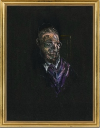
BACON REFLECTS ON POPE PIUS XII
A deeply human portrayal of Francis Bacon’s most enduring subject, Study for a Head, 1955 (estimate on request), is one of only a handful of works depicting Pope Pius XII: the current, living incumbent at the time of the painting. One of the last paintings of Pope Pius XII held in private hands, the others are housed in major museum collections including Pope II, 1951 (Kunsthalle Mannheim, Mannheim), Figure Sitting, 1955 (Stedelijk Museum voor Actuele Kunst, Ghent) and Study (Imaginary Portrait of Pope Pius XII), 1955 (Sainsbury Centre for Visual Arts, Norwich). Fascinated by men of power and authority, Bacon was attracted to the fundamentally tragic combination of violence and vulnerability latent in their status, and sought to capture this paradox in his Papal portraits. Whereas previous works had presented the Pope as a screaming, agonised phantom, Study for a Head presents a figure submerged in existential contemplation, riddled with the same quiet dignity and introspective tension that was to define Bacon’s first self-portrait the following year. Exhibited at Tate, London, in 1962, Study for a Head remained unseen by the public for over 40 years, resurfacing in major retrospectives at the Institut Valencià d’Art Modern, Valencia, in 2003 and at the Fondation Beyeler, Basel, the following year. Christie’s is pleased to be one of the sponsors of the current exhibition, Francis Bacon and the Art of the Past at the State Hermitage Museum in Russia, which will which showcase paintings from the Sainsbury Centre of Visual Art alongside masterpieces from the Hermitage. This exhibition will travel to Sainsbury Centre for Visual Art in Norwich in April 2015.

Francis Bacon (1909-1992), Study for a Head, oil on canvas, 40 x 30 1/8in. (101.7 x 76.5cm.). Painted in 1955. Estimate Upon Request © Christie’s Images Ltd. 2015.
Provenance: Hanover Gallery, London.
Mrs. Brenda Bomford, Aldbourne.
Marlborough Fine Art Ltd., London.
Lord and Lady Beaumont of Whitley.
Private Collection, Liege/ Zurich.
Lefevre Gallery (Alex Reed and Lefevre Ltd.), London.
Private Collection, London (acquired from the above circa 1970).
Lefevre Gallery (Alex Reed and Lefevre Ltd.), London (acquired from the above circa 1988).
Onishi Museum, Osaka (acquired from the above circa 1990).
Lefevre Gallery (Alex Reed and Lefevre Ltd.), London (acquired from the above in 1999).
Ernst Beyeler, Basel (acquired from the above circa 2000).
Acquired by the present owner in 2005.
Literature: R. Spira, ‘Londoner Ausstellungen: Francis Bacon in der Tate/Galerie’, in Weltkunst, XXXII, n. 13, Munich, 1 July 1962 (illustrated, p. 17).
R. Alley, Francis Bacon, London 1964, p. 95-96, no. 98 (illustrated, p. 199).
Exhibited: London, Hanover Gallery, Francis Bacon, 1959, no. 6 (incorrectly dated, titled Cardinal, illustrated on the cover).
Nottingham, Nottingham University, Francis Bacon, 1961, p. 1, no. 12 (titled Head of a Cardinal with Glasses).
London, Tate Gallery, Francis Bacon, 1962, p. 38, no. 39 (incorrectly dated, titled Pope). This exhibition later travelled to Mannheim, Städtische Kunsthalle; Turin, Galleria Civica d’ Arte Moderna; Zurich, Kunsthaus and Amsterdam, Stedelijk Museum.
London, The Lefevre Gallery, British Paintings 1900-1999, 1999, no. 2 (illustrated in colour, unpaged).
Valencia, IVAM – Institut Valencià d’Art Modern, Francis Bacon. Lo Sagrado y lo Profano, 2003-2004 (titled Study for a Head or Cardinal with Glasses, illustrated in colour, p. 74). This exhibition later travelled to Paris, Fondation Dina Vierny, Musée Maillol.
Basel, Fondation Beyeler, Francis Bacon and the Tradition of Art, 2004, p. 360, no. 8A (titled Study for a Head or Cardinal with Glasses, illustrated in colour, p. 344).
Notes: ‘It is true, of course, the Pope is unique. He’s put in a unique position by being the Pope, and therefore, like in certain great tragedies, he’s as though raised onto a dais on which the grandeur of this image can be displayed to the world’(F. Bacon, quoted in D. Sylvester, The Brutality of Fact: Interviews with Francis Bacon, London 1987, p. 26).
‘It was during those years [the 1950s], filled with rebuffs and reversals of fortune, but also with extraordinary invention and daring, that Bacon began to explore in depth all his great themes while trying out a number of others that he eventually discarded. It was, in my view, the most fertile single decade of his career. Never again would the Baconian world be so rich and diverse’ (M. Peppiatt, Francis Bacon in the 1950s, exh. cat., Sainsbury Centre for Visual Arts, Norwich, 2006, p. 14).
‘No other living painter has set forth with such pitiless clarity the tensions and paradoxes that surround all efforts to see, let alone to paint, the human figure in an age of photography’ (R. Hughes, ‘Singing with the Bloody Wood: A Second Celebration of Francis Bacon’, in Time, 1 July 1985, p. 54).
‘I would like my pictures to look as if a human being had passed between them … leaving a trail of the human presence and memory trace of past events’ (F. Bacon, 1955, quoted in Francis Bacon and the Tradition of Art, exh. cat., Kunsthistorisches Museum Wien, Vienna, 2004, p. 233).
Shrouded in silence amidst a deep black void, Study for a Head, 1955, occupies an outstanding position within Francis Bacon’s celebrated series of Papal portraits. A deeply human portrayal of Bacon’s most enduring subject, it stands as one of only a handful of works depicting Pope Pius XII: the current, living incumbent at the time of the painting, who reigned from 1939 until 1958. Where Bacon’s previous Papal portraits had given birth to screaming, agonised phantoms, bordering on caricature in their formal contortions, Study for a Head presents a figure submerged in existential contemplation, riddled with the same quiet dignity and introspective tension that was to define Bacon’s first self-portrait the following year. Mute and alone, animated only by the rapid brushstrokes that chart his worn visage, the figure is isolated upon a vacant ground, engulfed within the dark, cavernous depths of his own psyche. Subsumed by the weight of his grand station, his only anchor within the empty black chasm is a lone corner of gold framing – a stark reduction of the opulent Papal throne upon which he is eternally bound. At a time when the efforts of the Church and the vastly-expanding media cast the Pope as deified patriarch and noble celebrity, upheld before the public on an infallible pedestal, Study for a Head erases the trappings of Papal grandeur, presenting a pale, illuminated face, whose lines, shadows and tensions betray a deep-seated humanity. Bacon was fascinated by processional photographs of Pius being carried through St. Peter’s upon the shoulders of other cardinals, and his rare depictions of this contemporary figurehead include Pope II, 1951 (Kunsthalle Mannheim, Mannheim), Figure Sitting, 1955 (Stedelijk Museum voor Actuele Kunst, Ghent) and Study (Imaginary Portrait of Pope Pius XII), 1955 (Sainsbury Centre for Visual Arts, Norwich). By 1955, here was a man whose reign had witnessed the atrocities of the Second World War, and whose service would come to an end with his death just three years later. Solemnity and grace, terror and resignation, flicker in and out of focus behind his pale glasses, premeditating the mute, incarcerated Papal portraits of the 1960s. Exhibited at Tate, London, in 1962, Study for a Head remained unseen by the public for over 40 years, resurfacing in major retrospectives at the Institut Valencià d’Art Modern, Valencia, in 2003 and at the Fondation Beyeler, Basel, the following year.
Within the pantheon of Bacon’s oeuvre, the Papal portraits of the 1950s are widely regarded as the paragon of his artistic enquiries, and stand today among the foremost images of the whole of twentieth-century art. The Pope – a man tormented by his position as God’s messenger on Earth – was Bacon’s first and most significant subject, pursued over the course of 53 portraits during a period spanning almost twenty years. ‘It is true, of course, the Pope is unique’, Bacon explained. ‘He’s put in a unique position by being the Pope, and therefore, like in certain great tragedies, he’s as though raised onto a dais on which the grandeur of this image can be displayed to the world’ (F. Bacon, quoted in D. Sylvester, The Brutality of Fact: Interviews with Francis Bacon, London 1975, p. 26). The photograph of Pius sat in the artist’s studio alongside images of dictators and henchmen, as well as a reproduction of Diego Velázquez’s immortalPortrait of Pope Innocent X, whose own profoundly human tensions were an important source of inspiration to the series. Fascinated by men of power and authority, Bacon was attracted to the fundamentally tragic combination of violence and vulnerability latent in their status, and sought to capture this paradox in his Papal portraits. His earliest manifestations took the form of screaming ghouls, tortured figures in cages wracked with pain and anxiety. From the inaugural Head VI of 1949, through the first major trio of Popes (I, II and III) in 1951, to the seminal Study after Velazquez’s Portrait of Pope Innocent X of 1953 and the ensuing series of eight Studies for a Portrait, Bacon’s figures actively sought to escape their condition, depicted as writhing beings whose cries detonated the very structural integrity of the picture plane. By the early 1960s, these ethereal figures had denatured into deformed, demented creatures, incapacitated and silenced by their own paranoia: the Studies for a Pope of 1961 present tensile, muted figures, rooted to their chairs with fear and insanity.
Between these two extremes of hysteria, rarely was the Pope presented with the human compassion of Study for a Head. The work presents a masterful navigation between the twin poles of terror and madness: internalizing the tension of the tormented screaming Popes, the figure radiates a taciturn stillness that anticipates the later, silent half-beings. This is achieved through a subtle distillation of Bacon’s painterly technique. The artist allows liquefied swathes of black paint to soak into the very fibre of the canvas, creating an infinite, impenetrable abyss. On top of this, Bacon crafts his subject’s face with visceral immediacy, in such a way that the face appears to loom outwards like a spectre within the darkness. The rapid articulation of the Pope’s glasses, as well as his mouth, creates microcosmic arenas of tension that amplify the figure’s silence. Vertical striations of paint ram his lips shut, faintly echoing Bacon’s so-called ‘shuttering’ effect: the frenetic linear streaks that screech down the canvas in the earlier screaming portraits. The figure is bracketed by a simple fragment of gold framing. Unlike the gilded thrones represented in the earlier Papal works, the simple, reductive lines that enthrone the present work anticipate the clinical, diagrammatic chairs that subsume Bacon’s later, silent Popes. Bacon’s use of linear framing devices was a constant throughout his oeuvre: often compared to the Chinagraph marks used in photography to delineate areas for enlargement, Bacon construed these lines as formal, perceptual tools. ‘I cut down the scale of the canvas by drawing in these rectangles’, he said, in order to ‘concentrate the image down. Just to see it better’ (F. Bacon, quoted in D. Sylvester, Looking Back at Francis Bacon, London 2000, p. 40). Whilst Bacon’s earlier Popes had used these lines as compositional devices for imprisoning his screaming protagonists, Study for a Head transfers this aesthetic to the Papal throne itself: abstracted and devoid of all ornament, its presence is reduced to a simple geometric fragment. By the Papal works of the 1960s, the slippage between cage and throne was complete: the Pope’s grand seat of power was transformed into an inescapable prison – a straitjacket in which he silently descended into madness.
The use of secondary source imagery was to become definitive of Bacon’s practice, and the Papal portraits were among the first works in which the artist fully embraced this strategy. Working from photographs and reproductions allowed Bacon to access his unconscious, intuitive impulses – to paint from his nervous system, as he put it. ‘I think it’s the slight remove from the fact, which returns me onto the fact more violently’, he told David Sylvester. ‘Through the photographic image I find myself beginning to wander into the image and unlock what I think of its reality more than I can by looking at it’ (F. Bacon, quoted in D. Sylvester, The Brutality of Fact: Interview with Francis Bacon, London 1987, p. 30). In Study for a Head, this strategy allows the artist to transcend the objective, physical facts of his subject, creating a portrait not simply of a man, but rather of his existential condition. Though Pius is ostensibly the work’s subject, the figure’s appearance is heavily mediated by the visual properties of Velázquez’s portrait: the side-on angle, framed by the Papal throne, as well as the white collar and opulent purple robes – Bacon’s transmutation of Velázquez’s deep crimson. Across the breadth of the Papal works, individual features of Pius and Innocent oscillate and collide, shifting in and out of focus to produce a kind of hybrid archetype: a powerful Papal specimen filtered through the depths of Bacon’s own visual memory. Other visual sources enter the fray: indeed, the glasses that feature here and elsewhere are themselves a composite concoction, inspired as much by Pius himself as by the iconic film still of the screaming nurse in Sergei Eisenstein’s Battleship Potemkin. Bacon’s archive of source material, ranging from Poussin to contemporary newspaper clippings, provided a visual reservoir that allowed him to move beyond the simple act of representation, creating prototypes and paradigms of human emotion through multiple, serialised iterations. In 1955, the year of the present work, the artist described how ‘I would like my pictures to look as if a human being had passed between them … leaving a trail of the human presence and memory trace of past events’ (F. Bacon, 1955, quoted inFrancis Bacon and the Tradition of Art, exh. cat., Kunsthistorisches Museum Wien, Vienna, 2004, p. 233).
Bacon’s desire to depict the Pope’s humanity in Study for a Head is coterminous with his expanding exploration of the human condition in its broadest sense, exemplified by the corpus of non-Papal portraits from the late 1940s and 1950s. Indeed, the Papal works themselves have their roots in Bacon’s earliest Head series, with Head VI standing as the first surviving example. Throughout the 1950s, the production of Papal works was matched by an equally prolific output of portraits that, like the present work, were isolated within thick black voids, brooding with existentialist tension. Portraits of friends and early patrons, including the collectors Robert and Lisa Sainsbury whom Bacon first met during this period, were set within the same deep, dark chasms, silently pensive and imbued with contemplative dignity. It was also at this time that Bacon began his seminal Man in Blue series: arguably the secular, capitalist counterpart to the Popes, these works cast their protagonist as a museum-like relic, framed and spotlit within the metaphorical display cabinets of Bacon’s own psyche. This vernacular, with its subtle overtones of memento mori, also lay at the heart of Bacon’s Studies after the Life Mask of William Blake which are contemporary with the present work. The series presents eerie incarcerations of the visionary poet’s once-living head, preserved for eternity as a sculptural mould and illuminated within the dark abyss of time. Study for a Head, with its compositional austerity and aura of clinical examination, must undoubtedly be seen within the context of Bacon’s 1950s portraiture. Stripped of his divinity, the Pope is reduced to a specimen of humanity, placed on trial before his public as an object of scrutiny and marvel.
Significantly, it was within this compositional mode that Bacon undertook to represent himself in paint for the first time, the year after the present work. It has often been posited that the Papal portraits masquerade as self-portraits of sorts, much in the same way that Oskar Kokoschka and Egon Schiele painted themselves in the guises of prophets, priests and martyrs in order to interrogate the psychological anxieties of their time. The post-War era was marked by a fundamental questioning of humanity: its representations and systems of belief. The Existentialist philosophies of Jean-Paul Sartre, which rose to prominence during the 1940s, found their visual complement in ethereal figural sculptures of Giacometti: stark, elongated visions of the human form, reduced to their bare linear essentials. Imprisoned in the Cageworks of 1950, in a manner similar to Bacon’s own graphic framing devices, Giacometti’s sculptures contemplated the very substance of being precariously balanced on the brink of eclipse. For Bacon, the turmoil of the post-War era was matched by his own emotional turbulence. It was during the 1950s that his tempestuous relationship with Peter Lacy ran its course, reaching its denouement shortly after the present work. A former Spitfire pilot, Lacy’s persona embodied the same combination of brutality and vulnerability that drove Bacon’s fascination with figures of authority during this period. The artist’s troubled memories of his domineering father also loomed large in his memory at this time, and his portraits of the Pope – the ultimate Papa – were frequently strewn with the likeness of his own patriarch. In Study for a Head, Bacon presents a man whose identity is on the brink of dissolution. His tense lips strain to voice his predicament, yet silence prevails; trapped within the dark recesses of Bacon’s canvas, he stands as an illusory vestige of the artist’s own imagination.
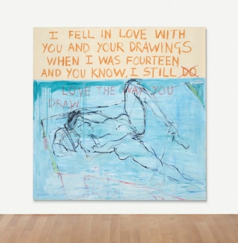
TRACEY EMIN EXORCISM OF THE LAST PAINTING I EVER MADE
Following the success of Tracey Emin’s iconic My Bed, 1998, which achieved a world record price at auction quadrupling its pre-sale estimate to realise £2,546,500/ $4,351,969/ €3,178,032 (estimate: £800,000-1,200,000) in July 2014, Exorcism of the Last Painting I Ever Made, 1996 (estimate: £600,000 – 800,000), documents a seminal moment of breakthrough within the artist’s oeuvre, witnessing an impassioned re-engagement with her painting and drawing practice after a six-year hiatus. Over a three week period Emin barricaded herself into a room at the Galleri Andreas Brändström, Stockholm, where, working completely naked, she launched herself into a frenetic artistic outpouring. Comprising 105 paintings, body paintings, drawings and letters, Exorcism of the Last Painting I Ever Made lays bare Emin’s entire artistic make-up, paying homage to her influences including Edvard Munch, Egon Schiele and Yves Klein. Emin’s paintings and drawings have since come to represent one of the most significant strands of her oeuvre, culminating in her appointment as Professor of Drawing at the Royal Academy of Arts, London, in 2011, and will be celebrated in the exhibition Tracey Emin – Egon Schiele: Where I Want to Go at the Leopold Museum, Vienna, in April this year.

Tracey Emin (b. 1963), Exorcism of the Last Painting I Ever Made, installation including 12 paintings, 7 body paintings, 79 works on paper, 7 letters, numerous painted items, art supplies, personal items, 1 bed and mattress and various other items of furniture, 1 radio and CD player, 9 music CDs, various newspapers and magazines and numerous kitchen and food supplies; dimensions variable. Executed in 1996. Estimate £600,000 – £800,000 ($907,800 – $1,210,400). © Christie’s Images Ltd. 2015.
Provenance: Galleri Andreas Brändström, Stockholm.
Anon. sale, Christie’s, London, 8 February 2001, lot 30.
Acquired at the above sale by the present owner.
Literature: B. Riemschneider and U. Grosenick (eds.), Art at the Turn of the Millennium, Cologne 1999 (Cologne version of the installation illustrated in colour, p. 149).
T. Warr (ed.), The Artists’s Body, London 2000, p. 68 (installation view illustrated in colour, p. 69 and on the cover).
Saatchi Gallery (ed.), 100: The Work that Changed British Art, London 2003, p. 209, no. 43 (illustrated in colour, p. 99).
H. Luard and P. Miles, Tracey Emin, London 2006, p. 220 and 413 (installation view, ‘Exorcism of the Last Painting I Ever Made 1996’ illustrated in colour, pp. 221-224).
N. Brown, TE Tracey Emin, London 2006, p. 88 (installation view, ‘Naked Photos: Life Model Goes Mad 1996’ (illustrated in colour, p. 89).
Love is What You Want, exh. cat., Hayward Gallery, London 2011, p. 248 (installation view, ‘Exorcism of the Last Painting I Ever Made’ illustrated in colour, p. 248).
Exhibited: Stockholm, Galleri Andreas Brändström, Exorcism of the Last Painting I Ever Made, 1996.
London, South London Gallery, I Need Art Like I Need God: Tracey Emin, 1997 (installation view, ‘Naked Photos: Life Model Goes Mad 1996’ illustrated in colour, pp. 38-39 and on the cover).
Cologne, Kölnsicher Kunstverein, Ca-Ca Poo-Poo, 1997-1998.
Amsterdam, Stedelijk Museum, Ten Years, Tracey Emin, 2002.
Edinburgh, Scottish National Gallery of Modern Art, Tracey Emin: 20 Years, 2008 (installation view, ‘Naked Photos: Life Model Goes Mad 1996’ illustrated in colour, nos. 23-25, installation view, ‘Exorcism of the Last Painting I Ever Made 1996’ illustrated in colour, no. 26). This exhibition later travelled to Malaga, Centro de Arte Contemporáneo and Bern, Kunstmuseum.
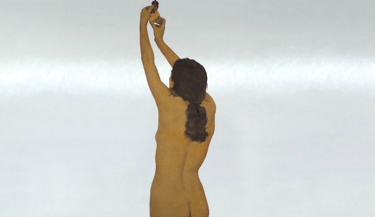
Notes: ‘Many artists have used female nudes in their work. I’ve got a good female nude I can use whenever I like and its mine … I’m my own muse. And it’s so liberating to be naked. You have a better sense of your own being’ (T. Emin, quoted in C. Freedman (ed.), Tracey Emin: Works 1963-2006, New York 2006, p. 166).
‘You might think Klein was being sexist by using those models like that, but actually it was something remarkable. Those women were not “muses”, they were dancers, and he was like a choreographer and there was a fantastic skill involved’ (T. Emin, quoted in J. Wainwright, ‘Interview with Tracey Emin’, in M. Merck and C. Townsend (eds.), The Art of Tracey Emin, London 2002, p. 197).
‘I knew when I was doing the Yves Klein and they [the audience] didn’t know I was going to do it. I heard a stampede across the gallery and “she’s doing an Yves Klein!” – all these people fighting to get at the portholes’ (T. Emin, quoted in J. Wainwright, ‘Interview with Tracey Emin’, in M. Merck and C. Townsend (eds.), The Art of Tracey Emin, London 2002, p. 198).
‘It was about being stripped and it could have been about being vulnerable but actually it wasn’t, it became about the ego and about the strength of the ego. The strength of my failures are all amalgamated together. It was called Exorcism of the Last Painting I Ever Made because it was for me to get rid of them, plus the fact that painting for me was completely moribund: it was completely bound up with failure. Failure – painting, painting – failure: two things joined together which I wanted to separate’ (T. Emin, quoted in J. Wainwright, ‘Interview with Tracey Emin’, in M. Merck and C. Townsend (eds.), The Art of Tracey Emin, London 2002, p. 198).
‘I have never not drawn, I have been drawing all my life’ (T. Emin, quoted in interview with A. Elkann, 11 December 2014, http://alainelkanninterviews. com/tracey-emin/ [accessed 5 January 2014]).
‘I am my own model. When you look at Picasso I am sure he used his own body as a model, all the women are square like he was. But then my favourite artists are Edvard Munch and Egon Schiele and they used themselves constantly in their work. So did Rembrandt and van Gogh’ (T. Emin, quoted in interview with A. Elkann, 11 December 2014, http://alainelkanninterviews.com/tracey-emin/ [accessed 5 January 2014]).
‘[Edvard Munch’s The Scream is] an incredible piece of work, and it needs to be championed for what it is, for its integrity. Someone painted the sound of a scream. People think it’s the figure screaming, but maybe it’s nature screaming at the figure’ (T. Emin, quoted in The Guardian Weekend, 12 October 2002, p. 32).
Documenting a seminal moment of breakthrough within Tracey Emin’s oeuvre, Exorcism of the Last Painting I Ever Made is an outstanding exposition of the artist’s celebrated painting and drawing practice. Executed in 1996, on the brink of her rise to critical acclaim, the work witnesses an impassioned re-engagement with these media after the prolonged six-year blockade against painting that followed the completion of her MA at the Royal College of Art. Over a three week period, in a groundbreaking act of catharsis, Emin launched herself into a frenetic artistic outpouring, filling streams of canvas and paper as she sought to dispel the fear and anxiety she had come to associate with painting. Working completely naked, she laid bare her entire artistic make-up, reinvigorating the visceral connection between her body and her art. Amidst candid diaristic notations and raw, self-reflective imagery, Emin forged expressive tributes to the grand canon of painters and draughtsmen that had nourished her artistic development. Paying homage to artists including Edvard Munch, Egon Schiele and Yves Klein, the resulting assemblage constitutes atour de force of her aesthetic outlook. Comprising rich painterly abstractions, sketched charcoal nudes and textual declarations evocative of her fabric and neon works, it represents a deeply personal interrogation of her artistic orientation. Each paper and canvas records the traces of Emin’s hand and body as she attempted to cast off her artistic inhibitions, interweaving her own physicality with elegiac stories from her past and those drawn from the history of modern art. Emin’s paintings and drawings have since come to represent one of the most significant strands of heroeuvre, culminating in her appointment as Professor of Drawing at the Royal Academy of Arts, London, in 2011. More recently, these media have witnessed a great resurgence in her practice, and in April this year, the Leopold Museum in Vienna will showcase a new body of her work in the major exhibition Tracey Emin – Egon Schiele: Where I Want To Go, placing her practice in dialogue with that of the great Expressionist master. In Exorcism of the Last Painting I Ever Made, we witness the critical moment of renaissance that paved the way for Emin’s exceptional contribution to the medium, now spanning over nearly two decades.
Exorcism of the Last Painting I Ever Made was originally conceived as an installation piece, created at the Galleri Andreas Brändström in Stockholm. Barricading herself in a room, visible only through a series of fish-eye lenses embedded in the walls, Emin invited viewers to watch her confront the medium that lay at the source of her six-year struggle. The installation, recorded in a series of photographs entitled Life Model Goes Mad, blurred the distinction between artist and muse: a poignant slippage for Emin, who had once earned a living as a life model. Now, at the dawn of her international career, Emin’s body became her artistic inspiration, forming the medium through which she would make her mark upon the blank surfaces around her. Harnessing every fibre of her being, both physical and mental, Emin’s ability to lay bare the facts of her own existence was ultimately to launch her work onto the global stage. She had recently completed her fabric tent Everyone I Have Ever Slept With 1963-1995, which was shown alongside the present work at the South London Gallery in 1997, and subsequently included in Charles Saatchi’s groundbreaking exhibition Sensation at the Royal Academy of Arts that same year. It was shortly after this in 1998 that Emin would create My Bed, subsequently nominated for the Turner Prize. In the same vein as these two landmark works, Exorcism of the Last Painting I Ever Made may be understood as a self-portrait of sorts: a retrospective coming-to-terms with her roots and a head-on engagement with her anxieties. Transcending its performative origins, the work stands today as a testament to the enduring power of painting and drawing as tools through which to confront the self in all its carnal and emotional complexity.
Following its exhibition at the South London Gallery – Emin’s first solo show in a public gallery space – Exorcism of the Last Painting I Ever Made was shown at the Stedelijk Museum, Amsterdam, in 2002. Between 2008 and 2009, it formed part of the seminal retrospective Tracey Emin: 20 Years which travelled from the Scottish National Gallery of Modern Art, Edinburgh, to the Kunstmuseum Bern, Switzerland, the Centro de Arte Contemporáneo, Málaga and the Stedelijk Museum, Amsterdam.
EMIN AS PAINTER AND DRAUGHTSMAN
Exorcism of the Last Painting I Ever Made takes its cue from the rich field of art-historical reference upon which Emin’s practice is founded. In the linear immediacy of her draughtsmanship and the rich, gestural vocabulary of her brushwork, she pays particular homage to the visual language of Expressionism, filtered through the narrative of her own experience. Advised by Carl Freedman to ‘paint something [she] would like to own’, Emin’s first creation in the Stockholm gallery was a self-portrait inspired by Munch’s The Scream – one of the artist’s favourite historical paintings. An image that spoke directly to the cathartic release at the heart of her project, The Scream has informed much of Emin’s subsequent practice: two years later she would create a live-action flm rendition of the painting at the edge of an Oslo Fjord, featuring the sound of her own piercing scream. Like Munch’s masterpiece, Exorcism of the Last Painting I Ever Made is informed by a desire to detonate feelings of pain and fear, and the physical connection between hand and canvas created a channel through which to confront this psychological tension. ‘I like things which are touched by people’s hands, and I like to feel the transference of the energy through that’, Emin has explained. ‘Every artist that I really adore works with the self and their own emotions’ (T. Emin, quoted in ‘My Bed 1998: Tracey Emin In Conversation’, Christie’s London, May 2014). In two of the three further tributes to The Scream contained within Emin’s assemblage, the artist makes explicit the emotional content of the motif, emblazoning the words ‘I’m just so fucking wound up’ and, in deep crimson red, ‘Most of my life has been built on fear’.
In Exorcism of the Last Painting I Ever Made, Emin’s attempt to dispel her longstanding blockade against painting saw her re-engage with her own corporeal form – a source of self-loathing for the artist at the time, in spite of the youthful beauty captured in the installation photographs. Emin’s exposed nudes paid homage to the drawings of Schiele, capturing his bold, schismatic linear style and overt presentation of the female form. Working completely naked, Emin fully embraced the connection between the body and the artwork, at times bringing about a re-evaluation of her male forbears. Covering herself in blue paint, she staged her own version of Yves Klein Anthropométries, imprinting her body and hands onto canvas in a demanding act of physical exertion. ‘You might think Klein was being sexist by using those models like that, but actually it was something remarkable’, Emin explains. ‘Those women were not “muses”, they were dancers, and he was like a choreographer and there was a fantastic skill involved’ (T. Emin, quoted in J. Wainwright, ‘Interview with Tracey Emin’, in M. Merck and C. Townsend (eds.), The Art of Tracey Emin, London 2002, p. 197). In recreating Klein’s immortalizing body prints, Emin performed her own intimate dance, experiencing the collision of fesh and canvas first-hand. To her unseen public, it was an instantly recognizable piece of theatre: ‘I knew when I was doing the Yves Klein and they [the audience] didn’t know I was going to do it’, she recalls. ‘I heard a stampede across the gallery and “she’s doing an Yves Klein!” – all these people fighting to get at the portholes’ (T. Emin, quoted in J. Wainwright, ‘Interview with Tracey Emin’, in M. Merck and C. Townsend (eds.), The Art of Tracey Emin, London 2002, p. 198).
Across the breadth of the work, further historical associations shift in and out of focus, documenting Emin’s determination to harness every aspect of her inner resources. Allusions to the figural works of Picasso and Matisse vie with richly-worked painterly surfaces, variously evoking the base tactility of Robert Rauschenberg, the gestural exuberance of Franz Kline and the sublime colour-field expanses of Abstract Expressionism. Her free-flowing application of paint, as well as the linear elegance of her graphic style, recalls the work of Cy Twombly, an artist whom Emin greatly admires. At the same time, Emin weaves a textual narrative through the work: a stream of consciousness laced with letters, slogans and diaristic outpourings. ‘I love you Sarah’ pays homage to her great friend and artistic partner at the time Sarah Lucas, with whom Emin had opened the renowned shop in Bethnal Green several years earlier. From invocations of hope and joy to those of resignation and fear, Emin’s unique brand of poetry reaches across multiple emotional registers. Indicative of her celebrated fair for contemporary story-telling, these written fragments recall the aesthetic of the early appliquéd blanket works that the artist had begun several years previously. Indeed, several of Emin’s paintings appear to mimic the format of her blankets, with their planar divisions of colour and superimposed text. Recreated in the medium of paint, however, Emin’s colour bands bleed across the picture plane in a manner almost reminiscent of Rothko.
INSTALLATION AND PERFORMANCE
The story of the work’s creation bears witness to the visionary nature of Emin’s early practice. It followed a prolonged period of artistic self-doubt brought about by her first abortion in May 1990. Looking back on this time, Emin recalls how ‘I gave up painting, I gave up art, I gave up believing, I gave up faith’ (T. Emin, ‘How it Feels’, 1996, in C. Freedman (ed.), Tracey Emin: Works 1963-2006, New York 2006, p. 67). Prior to her arrival in Stockholm, the ‘last painting’ Emin had made was an attempted version of The Deposition of Christ. ‘That was the last time I tried to make a painting as I understood a proper painting was supposed to be’, she recalls. ‘I painted it in 1990 after the Royal College when I had a small studio in Elephant and Castle. I went there every day and tried to be an artist, but it just wasn’t working’ (T. Emin, quoted in C. Freedman (ed.), Tracey Emin: Works 1963-2006, New York 2006, p. 255). By 1996, Emin’s blankets, sculptures and prints had attracted significant international attention, yet she was still unable to overcome her feelings towards painting. ‘I was possessed by fear and a feeling of guilt and loathing’, Emin explains. ‘I was still afraid of painting and that was tied to a fear of failure. I’d got to a certain point with my art where it was just becoming acceptable. Everything was going quite well except there were certain things that were blocked in terms of creativity. I wanted to break through that barrier’ (T. Emin, quoted in C. Freedman (ed.), Tracey Emin: Works 1963-2006, New York 2006, p. 255).
Emin’s fear of painting was amplified by a number of personal anxieties that she sought to address in her installation. As she later explained, ‘My Nan had just died as well, so I was very upset and I needed to sort out my head. I was afraid of the dark and I also detested my body, so there were quite a few things that I wanted to get out of the way’ (T. Emin, quoted in J. Wainwright, ‘Interview with Tracey Emin’, in M. Merck and C. Townsend (eds.), The Art of Tracey Emin, London 2002, p. 198). Within the secluded gallery space, isolated from everything except herself and her art, Emin had time to reflect. In choosing Sweden, rather than London or New York, the artist sought to avoid the sensationalism of the press. Her nudity was not an act of exhibitionism but rather an attempt to reconnect with her own physicality: a connection essential to the act of painting and drawing. All the paraphernalia of the outside world were removed: Emin lived alongside her ongoing work with little more than a bed, a radio, a kettle and a clothes line upon which, in the manner of Percy Shelley – whose work she had been reading – she hung out her stockings. Emin recalls ‘There was nothing but me filling the whole room’ (T. Emin, quoted in C. Freedman (ed.), Tracey Emin: Works 1963-2006, New York 2006, p. 255).
In charting Emin’s legendary breakthrough, Exorcism of the Last Painting I Ever Made represents not only a reconciliation with painting, but a fundamental reclaiming of the female nude. Over the course of her installation, Emin played the roles of both artist and model, capturing her own body in paint and on paper, and documenting this process in the photographic series Life Model Goes Mad. Blurring the boundary between subject and agent, Emin subverts the traditional associations between life drawing and the dominance of the masculine gaze. Unlike Yoko Ono’s performance work Cut Piece (1964), to which the installation is frequently compared, Emin’s role was active, not passive: whilst Ono invited viewers to cut pieces of fabric away from her clothed body, Emin was consciously and deliberately naked. ‘Many artists have used female nudes in their work. I’ve got a good female nude I can use whenever I like and its mine’, Emin explained. ‘I’m my own muse. And it’s so liberating to be naked. You have a better sense of your own being’ (T. Emin, quoted in C. Freedman (ed.), Tracey Emin: Works 1963-2006, New York 2006, p. 166). Yet Emin was not simply modeling her body; rather, she was laying bare the very essence of her artistic being, from her influences to her methods to her own physical form. As the artist explains, ‘It was about being stripped and it could have been about being vulnerable but actually it wasn’t, it became about the ego and about the strength of the ego. The strength of my failures are all amalgamated together’ (T. Emin, quoted in J. Wainwright, ‘Interview with Tracey Emin’, in M. Merck and C. Townsend (eds.), The Art of Tracey Emin, London 2002, p. 198). In this regard, Emin’s nudes speak not simply of the corpulence of the human form, but of a re-empowering of the artist’s own body as a source of creativity.
DAMIEN HIRST LULLABY WINTER
Damien Hirst’s iconic pill cabinet Lullaby Winter, 2002 is to be offered at Christie’s in February (estimate: £2.5-4million). Another from the series of four cabinets named after the four seasons, Lullaby Spring, sold at auction in 2007 for £9.65million, breaking the record for a work by a European living artist at the time of sale. Just as Monet painted the four seasons, Hirst captures the winter atmosphere with his assembly of thousands of beautifully hand-crafted pills. Precisely positioned on razor-sharp shelving and enshrined within a perfect, mirrored surgical steel cabinet, these pills number the amount a single human might expect to consume in a lifetime.

Damien Hirst (b. 1965), Lullaby Winter; glass, stainless steel, steel, aluminium, nickel, bismuth and cast resin, coloured plaster and painted pills with dry transfers; 72 x 108 x 4in. (182.9 x 274.3 x 10.2cm.). Executed in 2002. Estimate £2,500,000 – £4,000,000 ($3,782,500 – $6,052,000). © Christie’s Images Ltd. 2015.
Provenance: White Cube.
Ralph Burnet, Minnesota.
Notes: ‘Winter is the most beautiful of the seasons in some ways and it’s also the most truthful. Everything is laid bare, the end is fast approaching and there’s nowhere to hide. But ultimately it’s also a new beginning, a re-birth’ (D. Hirst in conversation with G. Burn, 2006).
‘Pills are the most phenomenal objects. It’s something to do with their minimal purity. Ultimately you just have no choice but to believe in them: these tiny, clean, brilliant Eucharistic forms set within nothingness, representing the infinite’ (D. Hirst in conversation with G. Burn, 2006).
‘It didn’t come from any of the things that I had, but it came from everything I had’ (D. Hirst cited in Damien Hirst and Gordon Burn, On the Way to Work, London 2001, p. 115).
‘I’ve always thought of the cabinet as being like a precipice or a void, it just consumes you, swallows you whole, and there’s obviously a huge irony in that because it’s really just a portrait of who we are, of these hopeful little things that we swallow to make ourselves feel more human, more alive, even immortal’ (D. Hirst, The Death of God, 2006, exh. cat., Galería Hilario Galguera, Mexico City, unpaged).
‘It’s like God should be, the way they sell you the pills, the forms, the utopia, the hope, the cure’ (D. Hirst, in an interview with H.-U. Obrist, In the darkest hour there may be light, exh. cat., Serpentine Gallery, London 2007).
In Damien Hirst’s Lullaby Winter, thousands of beautifully hand-crafted pills – numbering the amount a single human might expect to consume in a lifetime – are precisely positioned on razor-sharp shelving and enshrined within a perfect, mirrored surgical steel cabinet. In its stark yet colourful splendour, the cabinet stands as an exquisite monument to Hirst’s unremitting investigation of life, death, and the human condition.
Executed in 2002, Lullaby Winter is one of four stainless steel cabinets by Hirst that engage with the time-honoured allegorical motif of the changing seasons, following in the footsteps of masters such as Antonio Vivaldi, Nicolas Poussin, Claude Monet and Marc Chagall. Each of Hirst’s four iterations – Spring, Summer, Autumn and Winter – are defined by a unique combination of pills whose colours and arrangement are used to evoke the metaphorical attributes of each season. In Lullaby Winter, we are confronted with a dazzling white palette spiked with hues of pale pink, blue and pastel green, like a wide and expansive landscape, the effect is of a sparkling painterly interplay of light and colour. The meticulous rows of pills are replicated in the mirrored backplate, creating a clinical portrait of time and space, absence and loss, and yet, the resulting feeling is one of hope. As the artist explains: “Winter is the most beautiful of the seasons in some ways and it’s also the most truthful. Everything is laid bare, the end is fast approaching and there’s nowhere to hide. But ultimately it’s also a new beginning, a re-birth.”
For Hirst, the pills appeared to him as a way of filling what Max Beckmann described in 1915 as an “unending void” whose foreground we are compelled to fill in order to distract from its unfathomable depth. (Max Beckmann cited in Megan Craig, ‘Levinas and James: toward a pragmatic phenomenology’ (Indiana, 2010) p. 189). Hirst more recently expanded: “I’ve always thought of the cabinet as being like a precipice or a void, it just consumes you, swallows you whole, and there’s obviously a huge irony in that because it’s really just a portrait of who we are, of these hopeful little things that we swallow to make ourselves feel more human, more alive, even immortal.”
Hirst’s art has long been concerned with the consequences of living in a world consumed by the pharmaceutical industry’s promise of immortality. Many of his most iconic works tackle these themes, most notably the Medicine Cabinets and the Pharmaceutical Paintings. Lullaby Winter’s roots can be discerned in both these seminal series. Confronting the viewer as a brilliant wall-mounted monument, it assumes the spiritual power of a religious shrine. An altarpiece to medical science, Hirst’s cabinet presents an alternative system of organized belief: a new church that adopts pharmaceutical research as its sacrament. As the artist explained in 1993 after the first exhibition of the installation work Pharmacy (1992), pharmaceuticals are “very religious, kind of hopeful. There’s a lot of relocation of meaning in art, art has to reinvent itself every day. You try to pin these things down but there’s constant movement.” (Flash Art no. 169, 1993, interview with Adrian Dannatt). Much of Hirst’s oeuvre seeks to expose the ways in which the scientific advances in modern medicine have, for many, replaced our faith in the restorative power of religion. Harnessing the allegorical power of the four seasons, Hirst contrasts the transient passage of time with the life-giving power of modern medicine. In this way, the pills function both as a eulogy to the new religion of science, as well as amemento mori. Standing as a sublime meditation on mortality, the cabinet invites us to question ourselves, to confront our reflections in the mirrored steel behind the pills, and question whether the objects displayed within its shining interior are the answers to our dreams or prayers, or anything other than the talismans, relics and charms espoused by other faiths.
In Lullaby Winter, Hirst engages one of the central tenets of his practice: the distinction between the traditionally demarcated felds of science and art. Casting each pill as a meticulous simulacrum of its original, he highlights the disparity between our blind faith in medicine and our mistrust of the realities proposed by art. Hirst recalls one particularly pertinent memory of this tendency to invest an unquestioning faith in science, when accompanying his mother to the chemist; ‘she was getting a prescription, and it was, like, complete trust on the one level in something she’s equally in the dark about. In the medicine cabinets there’s no actual medicine in the bottles. It’s just completely packaging and formal sculpture and organized shapes. My mum was looking at the same kind of stuff in the chemist’s and believing in it completely. And then, when looking at it in an art gallery, completely not believing in it. As far as I could see, it was the same thing’ (D. Hirst, quoted in D. Hirst & G. Burn, On the Way to Work, London 2001, p. 25). As with so much of the artist’s work, the pill cabinets are fundamentally about our sociological need to construct belief systems out of nothing, about our need to come to terms with the often-mysterious fabric of existence. Lullaby Winteraddresses this need and the aesthetic allure of the pills is rendered useless in the face of their unknown medical purpose, as Hirst reminds, ‘we have to simply believe that somehow our ills will be cured.’
Hirst has often stated his belief that art possesses its own uniquely curative powers. In this context, the use of medical equipment and pharmaceuticals as a subject, and indeed medium, within his art makes this credence wholly explicit. His deep enquiry into the nature and purpose of art relates to his continuing exploration of immortality in his work. As the artist explains, ‘I’ve always really loved this idea of art, maybe, you know, curing people. And I have this kind of obsession with the body. I like the way that you’ve got all these individual elements inside a cabinet related to organs inside a body’ (D. Hirst, quoted in D. Hirst & G. Burn, On the Way to Work, London 2001, p. 25). The meticulously arranged pills in Lullaby Winter can be seen to visually represent the ordered yet unintelligible chaos of the biological world. Like the coloured spots of the Pharmaceutical Paintings, the formal order of the pills is both harmonious and indecipherable. Through the rigour of their organisation, Hirst comments upon the human desire to classify and control in a bid to keep our deepest fears at bay. In Lullaby Winter, we witness Hirst at the height of his creative powers and at his most playful, deploying colour, form and precision-engineering in order to confront the fragile boundaries between art and science and, ultimately, life and death. As he himself has asserted, ‘Art is the closest you can get to immortality’ (D. Hirst, quoted in S. Kent, ‘Death Becomes Him’, Time Out, no. 1892, November 2006, p. 47).
HOWARD HODGKIN IN THE GREEN ROOM
Painted over a three year period of unprecedented success for Howard Hodgkin, during which he represented Britain at the XLI Venice Biennale in 1984 and was awarded the Turner Prize in 1985, In the Green Room, 1984-1986, (estimate: £550,000 – 750,000) is one of the largest paintings made by the artist in the first thirty-five years of his career. Fully expected to break the world-record for the artist at auction, In the Green Room is an outstanding expression of Hodgkin’s unique artistic language that treads the boundary between abstraction and representation. Referring to the pistachio green paint with which he decorated the walls of his partner Antony Peattie’s sitting room in Cornwall shortly after they first met, the work evokes the personal and professional happiness enjoyed by Hodgkin at this time. It was featured in the Royal Academy’s landmark exhibition British Art in the 20th Century: The Modern Movement in 1987.

Howard Hodgkin (b. 1932), In the Green Room, oil on wood, 68 7/8 x 75 1/8in. (175.3 x 190.7cm.). Executed in 1984-1986. Estimate £550,000 – £750,000 ($832,150 – $1,134,750). © Christie’s Images Ltd. 2015.
Provenance: M. Knoedler & Co., Inc., New York.
P.C. Arts, Los Angeles.
Private Collection, Mexico.
Acquavella Galleries, New York.
Acquired from the above by the present owner.
Literature: A. Thorkildsen, ‘En samtale med Howard Hodgkin’, in Kunst og Kultur, Oslo, March 1987, p. 233.
M. Price (ed.), Howard Hodgkin Paintings with a catalogue raisonné. The Complete Paintings, Catalogue Raisonné, London 1995, pp. 186-187, no. 211 (illustrated, p. 186).
M. Price (ed.), Howard Hodgkin: The Complete Paintings, Catalogue Raisonné, London 2006, no. 211 (illustrated in colour, p. 226).
Exhibited: London, Royal Academy of Arts, British Art in the 20th Century: The Modern Movement, 1987, p. 382, no. 289 (illustrated in colour, p. 385).
Notes: ‘The surface of In the Green Room… seems to break out in large, freely applied brushmarks of scintillating orange paint and due to their joyful intensity, the resulting surface gives an impression of freedom. Yet Hodgkin has worked on the pictures for at least three years, adjusting the relationship of one section to another. The effect of spontaneity is achieved by controlled and painstaking effort which fnally results in a composition which combines logic and sensuality in a unique way’ (N. Rosenthal, ‘Three Painters of this Time: Hodgkin, Kitaj and Morley’, in British Art in the 20th Century: The Modern Movement, London, 1987, p. 382).
‘Hodgkin creates, through… spaces heavy with emotion, the texture of a dream – the way dreams are made of dangerous fragments of life slipping into and out of one another’ (D. Sylvester, quoted in Howard Hodgkin: Time and Place, exh. cat., Modern Art Oxford, Oxford, 2010, p. 83).
Executed over a three year period of unprecedented success for Howard Hodgkin during which he represented Britain at the XLI Venice Biennale in 1984 and was awarded the Turner Prize in 1985, In the Green Room is one of the largest paintings made by the artist in the first thirty-five years of his career. Rendered in a vibrant palette of forest green and royal blue, overlaid by a dappled pattern of brilliant, sunset orange brush marks, In the Green Room is a stunning, large scale example of Howard Hodgkin’s extraordinary commitment to painting and its emotive potential. Referring to the pistachio green paint with which he decorated the walls of his partner Antony Peattie’s sitting room in Cornwall shortly after they first met, the present work evokes the personal and professional happiness enjoyed by Hodgkin at this time. With thick, freely applied brushstrokes and bold use of pure colour and form Hodgkin evokes an intimate interior scene, constructing a fragmented reality that both reveals and conceals his subject. Through his complex use of colour, evocative, sweeping brush strokes and loosely geometric structures, Hodgkin addresses those elements of human experience whose expression is beyond the means of traditional representational painting. With its dynamic mark making and invigorating colour scheme, In the Green Room reflects the artist’s vivacity and self-assurance at this stimulating moment in his career. Contemplating the present work Norman Rosenthal has written: ‘The surface of In the Green Room…seems to break out in large, freely applied brushmarks of scintillating orange paint and due to their joyful intensity, the resulting surface gives an impression of freedom. Yet Hodgkin has worked on the pictures for at least three years, adjusting the relationship of one section to another. The effect of spontaneity is achieved by controlled and painstaking effort which finally results in a composition which combines logic and sensuality in a unique way’ (N. Rosenthal, ‘Three Painters of this Time: Hodgkin, Kitaj and Morley’, in British Art in the 20th Century: The Modern Movement, London, 1987, p. 382). Featured in the Royal Academy’s landmark exhibition, British Art in the 20thCentury: The Modern Movement in 1987, In the Green Room is an outstanding expression of Hodgkin’s unique artistic language that treads the boundary between abstraction and representation.
Hodgkin’s paintings are inspired by non-representational moments distilled through the artist’s mind’s eye, transforming the oneiric quality of memory into the tactile medium of painting. Eluding explicit figuration, the remarkable air of In the Green Room is articulated purely through Hodgkin’s extraordinary sensitivity to the effects of colour and his uncanny ability to stimulate an emotive response in the viewer. The result is a rich and complex series of painterly layers of colour and form that hints at representation without ever coming into focus. Hodgkin, in his own words, addresses the ‘evasiveness of reality’ (H. Hodgkin, quoted in ‘Howard Hodgkin interviewed by David Sylvester’ inHoward Hodgkin: Forty Paintings, 1973-84, exh. cat., Whitechapel Art Gallery, London, 1984, p. 97). David Sylvester has observed, ‘Hodgkin creates, through … spaces heavy with emotion, the texture of a dream – the way dreams are made of dangerous fragments of life slipping into and out of one another’ (D. Sylvester, quoted in Howard Hodgkin: Time and Place, exh. cat., Modern Art Oxford, Oxford, 2010, p. 83). The trace of the artist’s hand across the surface of the wooden board can be seen in the sweeps of rose pink and silvery grey superimposed over the network of orange impressions. It is through the artist’s intentional concealment and repetition of layered images that Hodgkin elicits a complex dialogue between artist and viewer.
In the Green Room presents us with a domestic interior, a recurring subject within Hodgkin’s work. From the combination of the environment depicted, the objects contained and the social interactions remembered, the artist creates paintings that reflect the psychological moment, using vivid colour and expansive form. From beneath the fanned out imprints of the artist’s brush emerges a blue vortex, directing the viewer’s gaze inwards towards a tantalising palimpsest: a green triangle is nestled in the underlying layers of paint, mirrored identically in the top left hand corner of the painting. This internalising gesture embroils the viewer in Hodgkin’s struggle between fatness and depth, drawing them into the composition as though entering a room, reminiscent of the spatial discontinuities of Matisse’s The Red Studio (1911), an artist that Hodgkin has long admired. The result is a total vision in which he concentrates the effects of the colours at the centre while also allowing the amplified Pointillist dots to add another layer of information to the picture. Hodgkin explains: ‘I would like to paint pictures where people didn’t care what anything was, because they were so enveloped by them’ (H. Hodgkin, quoted in A. Graham-Dixon, Howard Hodgkin, London 1994, p. 178). Hodgkin’s fascination with the domestic milieu, alongside his use of dense colour and irregular perspective has often drawn comparisons with French Intimist painters such as Édouard Vuillard and Pierre Bonnard for whom the artist has in the past professed admiration.
Despite the immediacy of his gestures, it often takes months of preparation for Hodgkin to execute a single brushstroke. Whilst the colours may be vivid and the brushstrokes energetic, the actual process of laying down the layers of paint may take a number of years and only end when the original inspiration finally appears in the artist’s mind. Painted over a period of several years, the vigorous brushwork and non-representational use of colour incorporates the scene from shifting viewpoints and with the changing perspectives caused by the passing of time. ‘My pictures are finished when the subject comes back,’ Hodgkin once told David Sylvester. ‘I start out with the subject and naturally I have to remember first of all what it looked like, but it would also perhaps contain a great deal of feeling and sentiment. All of that has got to be somehow transmuted, transformed or made into a physical object, and when that happens, when that’s finally been done, when the last physical marks have been put on and the subject comes back-which, after all, is usually the moment when the painting is at long last a physical coherent object-well, then the picture’s finished and the is no question of doing anything more to it. My pictures really finish themselves’ (H. Hodgkin, quoted in D. Sylvester, Howard Hodgkin: Forty Paintings, exh. cat., Whitechapel Art Gallery, London, 1984, p. 97).
TWOMBLY, DUBUFFET AND BASQUIAT
Following the world record price achieved for Cy Twombly’s blackboard painting in New York last November, Christie’s is delighted to offer a further outstanding example from the same year. A large, nearly two-metre-long expanse of painterly handwriting, Untitled (New York City), 1970 (estimate on request) is one of the last of Twombly’s final series of black board paintings. The work evolves from the distinctive ‘lasso-loop’ pictures that define the series, extending the artist’s free-flowing lines into a scrawl that borders on written notation. It is joined by Death of Pompey (Rome), 1962 (estimate: £4,000,000 – 6,000,000), one of the finest works from Twombly’s major series of paintings based on epoch-changing assassinations. As Twombly immersed himself in the ancient streets of Rome, his contemporary Jean Dubuffet sought to capture the joie de vivre of the 1960s Parisian heyday. Part of the artist’s landmark Paris Circus series, L’heure de la hâte (The Hour of Anticipation) (estimate: £1,800,000 – 2,500,000), captures the euphoria of New Year’s Eve. Painted on 28 December 1961, during the seminal year that Dubuffet returned to the city from the countryside, its rich painterly surface heralds the dawn of contemporary street art. In July 2014, Dubuffet’s Le gai savoir, 1963, a work from the same period, sold at Christie’s for £4,002,500, setting a new world record for the artist.
The critic Rene Ricard famously asserted that ‘If Cy Twombly and Jean Dubuffet had a baby and gave it up for adoption, it would be Jean-Michel. The elegance of Twombly is there … and so is the brut of the young Dubuffet’.[1] Jean-Michel Basquiat’s Three Delegates, 1982 (estimate: £5,000,000 – 7,000,000), is a superb demonstration of this lineage, painted during the critical year that cemented his rise from itinerant street artist to art-world superstar. Inspired by a childhood visit to the United Nations, it is one of only a handful of canvases featuring three of the artist’s dramatic skull-like heads. Rare for its deliberate rejection of text and slogans, the work showcases Basquiat’s raw painterly style at the height of its development.

Cy Twombly (1928 – 2011), Untitled (New York City). Oil based house paint and wax crayon on canvas, 144.7 x 177.8 cm. Executed in 1970. Estimate on Request © Christie’s Images Ltd. 2015.
Provenance: Giorgio Franchetti, Rome.
Anina Nosei Gallery, New York.
Gagosian Gallery, New York.
Ira Young, Los Angeles.
Gagosian Gallery, New York.
Private Collection.
Anon. sale, Sotheby’s New York, 9 May 2012, lot 29.
Acquired from the above by the present owner.
PROPERTY FROM AN IMPORTANT PRIVATE COLLECTION
Literature: H. Bastian, Cy Twombly: Catalogue Raisonné of the Paintings, Volume III 1966-1971, Munich 1994, p. 224, no. 107 (illustrated in colour, p. 225).
Notes: ‘After the capitulation of a vast style, Twombly has learned to write again’
(R. Pincus Witten, ‘Learning to Write’, 1968, quoted in N. del Roscio (ed.), Writings on Twombly, Munich, 2002, p. 57).
‘I never really separated painting and literature’ (C. Twombly, ‘History Behind the Thought’ Interview with Nicholas Serota, 2007,
Cy Twombly. Cycles and Seasons, exh. cat. Tate, London, 2008, p. 45).
Each line is the ‘actual experience with its own innate history. It does not illustrate – it is the sensation of its own realization’ (Documenti di una nuova figurazione: Toti Scialoja, Gastone Novelli, Pierre Alechinsky, Achille Perilli, Cy Twombly, L’Esperienza moderna, no. 2 (August-September 1957), p. 32.)
‘Here…the legacy of Abstract Expressionism is at issue: Twombly ventures into the area of an engulfing abstract sublime that Pollock had defined, and that had seemed off-limits to the art of the 1960s…(He)… replaces the coloured organicism of Pollock with colourless lines whose steady, progressive rise and fall insists on their attachment to the drier constraints of writing, will, and culture’ (K. Varnedoe, quoted in Cy Twombly: A Retrospective, exh. cat., MoMA, New York. 1994, p. 43).
Such ‘child-like’ quality to his line, Twombly once pointed out, is in fact, ‘very difficult to fake, to get that quality you need to project yourself into the child’s line. It has to be felt’ (C. Twombly, quoted in Hayden Herrera, ‘Cy Twombly, A Homecoming’, Harper’s Bazaar, no 3393, August, 1994, p. 147).
Painted in New York in 1970, this untitled work is one of the last of the famous series of ‘blackboard’ paintings that Cy Twombly made in a dramatic and distinctive burst of creativity between 1966 and 1971. A large, nearly two metre-long, shimmering, grey-ground spatial-field of elegantly lilting and layered scrawl ‘handwritten’ over a highly painterly surface, the picture is a hypnotic and mesmerizing work that intentionally breaks down the borders between painting and drawing. It is also a work that marks the final, climactic phase of this singular period in the artist’s career and its fusion into a unique style of painting which, between 1970 and 1971, was to characterize many of the grandest, most ambitious and monumental of all Twombly’s paintings.
Originating in 1966, Twombly’s ‘blackboards’ are a series of paintings that signified a radical new direction in the artist’s work. Distinguishable for their strict graphic regularity, severe formal restraint and often apparent emptiness, these, in some ways, Minimalist-looking pictures, were ones that marked a startling departure from the schismatic and often Baroque lyricism of the artist’s earlier, predominantly white-ground pictures, rooted in the history, mythology and emotion of the Mediterranean landscape. Instead, Twombly’s ‘blackboards’ appeared to demonstrate the artist’s return to and renewed interest in the primacy of drawing and in the use of line as a conveyer of the human imagination.
Made, more or less consistently between 1966 and 1971, Twombly’s ‘blackboard’ paintings are so-named because, when they were first exhibited, they appeared to the critics of American art magazines such as Artforum and ArtNEWS to have been inspired by the notion of the classroom blackboard or the child’s primer as a temporal and highly graphic carrier of information. As in this example from 1970, these paintings were also predominantly, though not always, made on a series of swiftly executed dark-grey oil-paint backgrounds that resembled the slate of a blackboard. In the case of Untitled (New York City), its ground has been made using broad sweeps of a large brush. Here, the dark grey paint has been allowed, even encouraged, to drip and splash in places so that it generates an organic, unformed and dynamic surface that contrasts openly with the linear logic, regularity and continuum of the ‘writing’ in oil crayon which, in the main, has been applied over the top of its irregular surface. In some places, both ground and ‘text’ have, however, been inter-layered into one another. Here, Twombly has obscured earlier writing by painting over it with a brush before subsequently adding further lines and layers of lines. In this way the painting becomes a kind of palimpsest where both the drawn and the painted elements of the picture appear interwoven and interdependent. As a consequence, Twombly’s ‘writing’ almost magically appears to be both emerging from and simultaneously dissolving into the picture’s dark, monochromatic ground.
Between 1966 and the climactic end of this distinctive series of works in 1971 when they effectively evolved into another epic series of paintings known as Nini’s Paintings, around three or four distinct types of ‘blackboard’ paintings can be identified. Each of these ‘types’ signified a different and developing exploration of the graphic language of representation using only the simplest, most reductive and restrained of pictorial means. Growing out of the very first of these works – paintings such as Problem now in the Moderne Museum für Kunst, Frankfurt and Nightwatch of 1966 – were a series of sparse and comparatively empty, grey-ground, paintings that centred on forms of the very simplest geometry, executed in the manner of chalk diagrams on a classroom blackboard and shown, as if moving, transforming or even evolving in space. Preoccupied with the linear depiction of measurement, geometry, form and space, these works were to evolve, under the influence of the Apollo moon-landings of July 1969 and all their talk about space-time calculation into paintings (the Bolsena and Treatise on the Veil pictures) that attempted to render the monochrome picture plane as if it were an Einsteinian field of space-time through which drawing and written notation moved. Along with his preoccupation with space and the graphic, hand-drawn line, the element of time is a central theme that runs through all of Twombly’s ‘blackboards’. Twombly’s languid, flowing line does not just articulate a division of form and space in these paintings but is also a rhythmic and graphic delineation of speed and duration and therefore also of time. Untitled (New York City), with its suggestion of half-formed letters and glyphs combining together to establish a uniform sense of an energized field of graphic activity, asserts itself in this context as if it were some kind of balanced but indecipherable equation that occupies just such a space-time realm. Its fluid linguistic lines magically seem to emerge, Belshazaaar-like, from the dark impenetrable surface of the painting as if they were some kind of seismographic recording in space and time of the passage of language through the history.
Belonging to the final ‘type’ of ‘blackboard’ paintings that Twombly made, Untitled (New York City) is a work that evolved out of perhaps the most distinctive and symptomatic of all the series – the so-called ‘lasso-loop’ pictures – in which, within the strict, rectangular format of the canvas, Twombly set out to push a simple and deliberately constrained system of mark-making to its limits, or even beyond them. For these works, Twombly repeatedly and methodically drew out in crayon a single, repetitive and seemingly endless flowing progression of loosely-scrawled, looping lines. Effectively the product of one continuous line that overlaps itself to the point where it almost dissolves into a single, holistic, energized spatial field of graphic activity, the lasso-loop paintings often appear to hover on the very borderlines of the formal logic and structure that has given rise to them. By pushing this logic to its limits, these are pictures that both explore the innate quality of line as an articulation of form and space and expose the precise point where line also becomes integrated into a wider, collective field of expression and meaning. Most importantly perhaps, with regards to Untitled (New York City) of 1970, these are works that begin to reveal the exact moment or place where the graphic art of writing and drawing starts to fuse into and become the more cohesive, plastic art of painting. For, it is exactly this aspect of these works that Twombly set out explore the similarly formatted ‘blackboards’, he began in New York in 1970, and of which Untitled (new York City) is one of the first examples.
Painted not in Italy, but in what Twombly himself described as the ‘relatively cooler’ (more restrained) atmosphere of New York in 1970, where the aesthetics of Minimalism and Conceptualism then prevailed, Untitled (New York City) is a work that follows the same formal logic of the early lasso-loop ‘blackboards’ but extends it away from their repetitive looping progression into the realm of written language and its use of line as a carrier of codified meaning. Instead of the repetitive, but essentially meaningless, progression of line in the lasso-loops, Twombly now attempted to translate the instinctive, unconscious, near-habitual and gestural impulses of the hand, when writing, into the creation of a single integrated field of form.
Marking a coming together therefore, between the reductive logic of his ‘blackboard’ paintings and the intuitive impulse of his earlier white-ground pictures, Twombly has in works such as Untitled (New York City), taken the Surrealist technique of automatic writing and the free-form gestural field of play that Jackson Pollock made out of it and turned it back on itself. Pollock’s open gesture here becomes a graphic form of self-inquiry. Writing in a freeform, impulsive and unconscious flow that makes use of the hand and the mind’s instinctive desire to express and to form, Twombly has here, using his whole body, gesturally written in such a way that it is the innately human, intellectual impulse towards writing that comes to be expressed. Taking care only that the painting remain wholly abstract – that such writing does not fall into habit, convention or recognisability, but remains indecipherable – that no clear letter, number or other interpretable symbol should, like a representational image come to disturb the apparently continuous flow of impulsively arrived-at abstract form – Twombly uses the restrictive format of the blackboard to create a uniform field of energy that stands also as a kind of illustrative landscape of the human mind. Seeming to be both embedded in and emerging from the painterly surface of the work, this energized ‘field’, with its powerful graphic suggestions of thought, gesture, expression and of the passage of time, appears, like a palimpsest, to entrap within itself something of the essence of the human intellectual impulse and of our inner need to externalize, formalize and materialize such thought.
It is in this respect that Untitled (New York City) marks Twombly’s return to and reinvestigation of a kind of handwritten mark that the artist had frst explored in the mid-1950s while sharing a studio with Robert Rauschenberg in Fulton Street, New York. There, inspired by the then dominant examples of Jackson Pollock and Jean Dubuffet but also by the work of John Cage whom, with Rauschenberg, he had encountered at Black Mountain College, Twombly had embarked on an ambitious series of large ‘handwritten’ black and white paintings. Throughout much of 1954 and 1955 Twombly had worked on these large-scale, free-form and highly ambitious paintings before ultimately abandoning and destroying them. Only one masterpiece – the three-and-a-half metre-long painting Panorama of 1954 now survives from this major series. Seeming, like Untitled (new York City) in fact, to be simultaneously expressive of both emptiness and fullness, these paintings reflected Twombly’s interest in the written fragment, the glyph, the cypher and the impulsive creative gesture as elementary forms or archetypes – things indicative and revealing of something both primordial and innately human.
Caught between what Nicholas Cullinan has described as ‘rebus and ruin’, these paintings were a startling combination of stasis and flux, of fixed sign and fluid gesture born out of a combination of the fragmented use of words, space and graphic form in the poetry of Stephane Mallarmé and Ezra Pound, as well as Twombly’s own experience of cryptography during his military service. (Nicholas Cullinan, quoted in Twombly and Poussin Arcadian Painters exh cat. London, 201, p. 94) These ‘black and white’ paintings evidently did not prove satisfactory to the artist however, and, after abandoning them – his first series of paintings on a dark ground – Twombly rarely returned to the themes they had addressed until the creation of the ‘blackboards’.
It appears that it was the re-evaluating experience of making the ‘blackboard’ paintings in the late 1960s and the pared down, restrictive logic of these works that ultimately encouraged Twombly, in 1970, to embark, in works such as Untitled (new York City), on a revisiting of the same territory he had abandoned in New York fifteen years earlier. As in 1955, Twombly’s re-embracing of such fluid and impulsive mark-making almost immediately gave rise to a creative explosion and a dramatic increase in the scale of his pictures until soon, he was making some of the largest and most ambitious paintings of his entire career. Once again venturing into what Kirk Varnedoe described as ‘the area of an engulfing abstract sublime that Pollock had defined,’ works like Untitled (New York City) led swiftly onto the creation of a sequence of truly monumental examples of this style in ‘handwritten’ paintings that measured between four and over six metres long. (Kirk Varnedoe quoted in Cy Twombly: A Retrospective. exh. cat. MoMA, New York. 1994. p. 43). These were works of which Varnedoe was to write: ‘Here, even more than in the earlier Panorama, the legacy of Abstract Expressionism is at issue: Twombly ventures into the area of an engulfing abstract sublime that Pollock had defined, and that had seemed off-limits to the art of the 1960s. The prospect of extending and remaking Pollock’s legacy by changing everything deemed essential to his art might appear as perverse as the notion of a grand subjective expression built on Minimalist reduction, and yet both are here, remarkably realized. Twombly replaces the coloured organicism of Pollock with colourless lines whose steady, progressive rise and fall insists on their attachment to the drier constraints of writing, will, and culture.’ (ibid, p. 43).
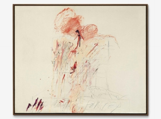
Cy Twombly (1928-2011), Death of Pompey (Rome), signed, titled, inscribed and dated ‘Cy Twombly Rome 1962 The Death of POMPEY’ (lower centre), oil and graphite on canvas, 57 ¼ x 69 ½ in. (145.3 x 176.5cm.). Executed in 1962. Estimate £4,000,000 – £6,000,000 ($6,052,000 – $9,078,000) © Christie’s Images Ltd. 2015.
Provenance: Galleria La Tartaruga, Rome.
Private Collection, Brussels.
Galleria Gian Enzo Sperone, Turin.
Acquired from the above by the present owner circa 1970.
Property of an Important Private European Collector
Literature: H. Bastian, Cy Twombly: Catalogue Raisonné of the Paintings, Volume II, 1961-1965, Munich 1993, no. 129 (illustrated in colour, p. 195).
Exhibited: Brussels, Palais des Beaux-Arts, Cy Twombly, 1965, no. 26.
Notes: I like the idea of scratching and biting into the canvas. Certain things appeal to me more. Also prehistoric things, they do that scratching. But I don’t know why it started.’ (C. Twombly, ‘History Behind the Thought’, quoted inInterview with Nicholas Serota, 2007, Cy Twombly. Cycles and Seasons, exh. cat., Tate, London, 2008, p. 48).
‘Each line is now the actual experience with its own innate history. It does not illustrate – it is the sensation of its own realisation’ C. Twombly, ‘Documenti di una nuova figurazione: Toti Scialoja, Gastone Novelli, Pierre Alechinsky, Achille Perilli, Cy Twombly’, L’Esperienza moderna, no. 2, (August- September 1957, p. 32).
‘One of the prime guiding spirits behind (Twombly’s) combination of the decorative and the gruesome… was the painter Francis Bacon. Twombly’s admiration for the British artist – whom he considers ‘the last great European painter’ – has its grounding in his long-standing dialogue with the tradition of European expressionism. Bacon’s efforts to bring the meaty power of that kind of painting into the barer existential spaces of post-war experience, and to make a personal poetry by mixing lush painterly aesthetics with a sense of the gross materiality of the life of the flesh, were ready avenues of affinity’ (K. Varnedoe, ‘Inscriptions in Arcadia’, Cy Twombly, exh. cat., New York, 1994, p. 37).
Housed in the same private collection since the 1970s, Death of Pompey is one of the finest of a major series of paintings on the theme of epoch-changing murders and assassinations that the artist made in 1962. The paintings that comprise this ‘assassination’ series are a sequence of large pictures on the theme of the Death of Giuliano de Medici, two oil paintings of the Death of Pompey (the first, now in the Kunstpalast Museum, Dusseldorf – the second, larger and final version is the present work), The Vengeance of Achilles (Kunsthaus, Zurich) and two paintings of the assassination of Caesar entitled the Ides of March.
With its scrawled, smeared and seemingly bloodied, flesh-like surface, this final version of the Death of Pompey is a stark, graphic and highly visceral portrait of both the act and the consequences of such an historic assassination. The material product of a series of dramatic physical interactions with his paint, in which Twombly, using his bare hands, has scratched, clawed and twisted his fingers through the thick plastic medium of his paint, it is a highly visceral painterly emulation of a murderous assault upon the physical material of the human body.
Breaking down the borders between action-painting, portraiture, history painting and performance art, Death of Pompey is part of a series of works that followed on from the explosive and highly physical release of passion, eroticism and visceral energy that had defined Twombly’s Ferragosto paintings, made throughout the hot summer months of 1961. Like the majority of paintings made in the immediate aftermath of these seminal new works, Death of Pompey is also infused with the new and distinctly Baroque mix of eroticism and violence that came to dominate the artist’s work until 1966. As Kirk Varnedoe has pointed out, Twombly began the year 1962 with ‘a masterpiece’ in the form of Leda and the Swan now in the Museum of Modern Art, New York. And it was this tumultuous painting of the rape – which through its progeny, Helen of Sparta, was to give rise to the Trojan War – that was followed later in the year by the series of paintings on the not-unrelated theme of epoch-changing political assassinations to which Death of Pompey belongs. With the exception of The Vengeance of Achilles, which depicts an imposing phallic spearhead in the form of a giant letter ‘A’ dripping in blood, each of these 1962 ‘assassination paintings’ is not just thematically associated but also built upon a similarly simple format.
In each of these works Twombly has centred his painterly activity upon a loosely scrawled pencil drawing of a perspectival grid-like form that calls to mind either a chair, a plinth, an entrance door or a stage-set. Clearly indicative of a specific but also undefined space or locale, this rationally organized, grid-like structure functions in direct contrast to the freeform drip, splash and play of the paint above it. But it serves the purpose of pinpointing the arena within which all the wild, violent, drama and formless action and interaction with matter that Twombly ‘performs’ in the making of these works, is to take place. Literally setting the stage therefore, for the artist’s actions, this simple formal structure or graphic device acts as a focal point for the uniquely creative and destructive play with material that goes on above it. At the same time, like an armature, it also anchors the open and freeform nature of this play into a sense of its being rooted in a specific space and moment in time.
Each of the works in this series refers to a momentous and epoch-changing event in Italian history. Twombly’s Death of Giuliano de Medici paintings refer to the murder of Giuliano de Medici by an assassin working for the Pazzi family in 1478. This younger and famously beautiful brother of Lorenzo de Medici, was stabbed to death mercilessly and repeatedly as he tried to enter the large doors of the Duomo in Florence on April 26th of the year. An especially violent and public crime (Guiliano was stabbed over nineteen times) it was a politically motivated assassination that marked the beginning of a long period of brutal violence and political killing in Florentine politics. Twombly’s paintings entitledDeath of Pompey and the Ides of March similarly refer to two other historic betrayals and public assassinations – ones that, in these cases, marked both the end of the Roman Republic and the beginning of the Imperial Roman dynasty. The great Roman General and rival of Julius Caesar, Gaius Pompeius Magnus (Pompey), was stabbed to death by his entourage as he disembarked along the plank leading from a small boat to the shore on his landing in Egypt in 48 B.C. Caesar too was famously assassinated on the steps of the Roman senate four years later, dying from stab wounds, it was noted, at the feet of a statue of his former rival, Pompey.
Fusing the drama of the murderous moment of assault with a near representational depiction of its gruesome consequences on the body of the victim, in each of these ‘history’ paintings Twombly has gone through a kind of painterly reenactment of both the acts of wounding and of being wounded, in order to create the picture. Recording the material traces of the violent energy with which it has been splashed, thrown, dripped, gorged, squeezed and pulled onto the canvas, Twombly’s paint in these works simultaneously suggests both the violence of wounding another human being and the visceral nature of the wounds themselves. As Twombly once said of his graphic line – that it ‘doesn’t illustrate’, but is rather, ‘the actual experience with its own innate history… the sensation of its own realization’ – here, Twombly’s fleshy, hand-scrawled paint operates in just the same way. (C. Twombly, ‘Documenti di una nuova fgurazione: Toti Scialoja, Gastone Novelli, Pierre Alechinsky, Achille Perilli, Cy Twombly’, in L’Esperienza moderna, no. 2, August-September 1957, p. 32).
As the large lumps of paint thrown, splashed and smeared across the grid of Death of Pompey show, Twombly’s use of paint echoes in many respects the use to which it was sometimes put by painters that he admired such as Chaim Soutine and most especially, in this case, Francis Bacon. As Kirk Varnedoe pointed out in 1994, ‘One of the prime guiding spirits behind (Twombly’s) combination of the decorative and the gruesome…was the painter Francis Bacon. Twombly’s admiration for the British artist – whom he considers ‘the last great European painter’ – has its grounding in his long-standing dialogue with the tradition of European expressionism. Bacon’s efforts to bring the meaty power of that kind of painting into the barer existential spaces of post-war experience, and to make a personal poetry by mixing lush painterly aesthetics with a sense of the gross materiality of the life of the flesh, were ready avenues of affinity’ (K. Varnedoe, ‘Inscriptions in Arcadia’, Cy Twombly, exh. cat., New York, 1994, p. 37).
In 1962, Bacon himself was re-exploring historic themes of violence and torment in his Crucifixion triptych and a renewed series of Papal portraits. With its suggestion of an act of murder in a fixed rectangular space Death of Pompey is a work that in many ways recalls some of the tortured figures and broken bodies of Bacon’s screaming popes, crucifixions and blooded bodies pinned to a bed. Eschewing the manifest figuration of Bacon’s painting, but not the visceral and material play with paint that the British artist often brought to his work, a picture such as Death of Pompey displays a similarly tactile and material appreciation of oil paint as a highly evocative and corporeal substance. At the very centre of Death of Pompey, for instance, the suggestion of a stab wound oozing blood is clearly suggested by the thick crimson paint that has been squeezed directly from the tube and left to pour down the canvas. In other places Twombly’s hands have clawed through the thick paint leaving fnger marks in the surface as if to evoke a falling man desperately attempting to cling on to life. Several of these ‘assassination’ paintings are also accompanied, as here, by a crimson-stained hand-mark imprinted onto the raw canvas. Recalling the earliest, most primordial creative act of cave painters, this imprint also functions paradoxically as a kind of murderous signature – as if it were the physical trace of the assassin wiping clean his blood-stained hands.
By appearing, through painterly reenactment, to simultaneously exist both right in the moment of the murderous act and to be looking back on it from the vantage point of history, Twombly’s ‘assassination’ paintings assert themselves as epic visionary pictures that exist outside of time. They are paintings that assert a fascinating duality that is reflective of the artist’s own position as a relative newcomer to Rome, observing the Eternal City and the endless cycle of creation and violent destruction that so distinguishes Mediterranean culture, from a wholly independent viewpoint. The duality that Twombly establishes in these works however is not just one contrasting the raw, visceral and exciting drama of the crime with the tragic, long-term, even epoch-changing nature of the event, it is more than this. It is a duality that speaks powerfully, through a combination of the creative but often violent act of painting itself and the destructive but often desirous act of murdering a figure head, of the timeless and elemental relationship between Eros and Thanatos. At its heart, Death of Pompey is a work that speaks, both eloquently and disturbingly therefore, of the fundamental and integral connection that exists on a primordial level between the twin forces of creation and destruction themselves.

Jean Dubuffet (1901-1985), L’heure de la hâte (The Hour of Anticipation), signed and dated ‘J. Dubuffet 61’ (lower right); signed, titled and dated ‘L’heure de la hâte J.Dubuffet décembre 61’ (on the reverse); oil on canvas, 51½ x 38¼in. (129.5 x 97cm.). Painted on 28 December 1961. Estimate £1,800,000 – £2,500,000 ($2,723,400 – $3,782,500) © Christie’s Images Ltd. 2015.
Provenance: Galerie Daniel Cordier, Paris.
Stephen Hahn Gallery, New York.
William Beadleston Fine Art, New York.
Anon. sale, Christie’s Paris, 30 May 2011, lot 14.
Literature: Connaissance des Arts, no. 124, June 1962 (illustrated, p. 29).
M. Loreau (ed.), Catalogue des travaux de Jean Dubuffet, Paris Circus, vol. XIX, Paris 1965, p. 221, no. 251 (illustrated, p. 131).
Exhibited: Paris, Galerie Daniel Cordier, Dubuffet: Paris Circus, 1962, no. 22.
Notes: ‘My desire is to make the site evoked by the picture something phantasmagoric, and that can be achieved only by jumbling together more or less veristic elements with interventions of arbitrary character aiming at unreality. I want my street to be crazy, my broad avenues, shops and buildings to join in a crazy dance, and that is why I deform and denature their contours and colours’ (J. Dubuffet, quoted in A. Franzke, Dubuffet, New York 1981, p. 148).
‘Both Dubuffet and Basquiat were engaged in a methodical exploration of states of perception, knowing, and being. They used the means that best suited their purpose, arriving at remarkably similar artistic forms’ (L. Rinder, quoted in Dubuffet and Basquiat: Personal Histories, exh. cat., Pace Wildenstein, New York, 2006, http://www.pacegallery.com/newyork/exhibitions/11804/ dubuffet-and-basquiat-personal-histories [accessed 3 June 2014]).
‘Jean Dubuffet has shed his ground-worshipper tunic. The period of austerity is over. His ‘matériologue’ side sleeps; make way for the playful and theatrical Janus, the dancer and shouter’ (M. Loreau, in Catalogue des travaux, Fascicule XIX, Paris-Circus, Paris 1965, p. 7).
An electrifying outburst of wild, hallucinogenic ecstasy, Jean Dubuffet’s L’Heure de la hâte (The hour of anticipation) is an intoxicating phantasmagoria of psychedelic colour and form that captures the high-octane hedonism of the Parisian heyday. With its two personnages caught up in a frenetic rave, a hypnotic explosion of chalk-like scrawl and schismatic impasto creates a mesmerizing optical density. Part of the artist’s landmark series Paris Circus, it was painted in 1961, the seminal year that Dubuffet returned to the bright lights of the city and marvelled at its transformation. Gone was the gloom of post-War Paris, its scars and shadows replaced by a heady metropolis and cosmopolitan joie de vivre. Painted on 28 December, L’Heure de la hâte presents a heightened euphoria on the brink of the New Year: its title, suggestive of frenzy and expectation, evokes a carefree abandonment of the past and an unbridled celebration of future promise. Over the course of the festive period, Dubuffet painted a handful of similar works, including, L’instant propice (Propitious Moment) which, created just five days later, is held in the collection of the Solomon R. Guggenheim Museum, New York. Embracing the spirit of the hour, Dubuffet ushers in an untamed visual language for a new urban culture, heralding the dawn of contemporary street art and prefiguring the work of Jean-Michel Basquiat in 1980s New York. Within this visionary rhapsody of colour, texture and noise, background and foreground fluctuate to an undulating beat, pulsing with raw vitality and drawing the viewer into a chaotic hyperreality. In the immediacy of Dubuffet’s brushstrokes, we feel the life-force of the festivities and the thrill of the dance. Against a deliberately fat backdrop of caustically-applied black, Dubuffet’s two primal figures are thrown into oscillating relief, powerful symbols of a new generation swept along by the freedom and joy of the 1960s. In Paris Circus, every day was a celebration: daily existence was fresh and exciting, with quotidian phenomena seen through tinted lenses of optimism and desire. ‘Over and done with the mystical jubilations of the physical world’, Dubuffet exclaimed‘… It is the unreal now that enchants me’ (J. Dubuffet, quoted in A. Franzke, Dubuffet, New York 1981, p. 147).
Dubuffet had returned to Paris from a six-year self-imposed retreat to the countryside at Vence. There, he had immersed himself in a dark, rural aesthetic of earthbound materiality, studying the textures of the soil and ground in minute detail. His fascination with organic matter, as expressed in his Texturologies, Topographies and Matériologiesof the late 1950s, allowed him to escape the sobriety of post-War Paris, bringing him into contact with sites of growth and life. In his absence, however, the city was born anew, transformed from a war-torn capital into a thriving social and cultural epicentre. Upon his return in 1961, Dubuffet lifted his eyes from the earth below his feet and was struck by the vibrant splendour of his new surroundings. The force of this revelation gave birth to Paris Circus, and brought with it the dawn of one of the very first truly urban aesthetics. The artist was swept up in the whirl of the city, captivated by the energy coursing through the Parisian shop windows and streets, bustling with cars, people, laughing, talking and dancing. Paris was a feast and Dubuffet became its entranced portraitist. ‘Jean Dubuffet has shed his ground-worshipper tunic’, wrote Max Loreau. ‘The period of austerity is over. His “matériologue” side sleeps; make way for the playful and theatrical Janus, the dancer and shouter’ (M. Loreau, in Catalogue des travaux, Fascicule XIX, Paris-Circus, Paris 1965, p. 7). The sombre tones of his previous output were replaced by a vibrant palette of reds, blues, yellows and pinks, whilst the primitivistic energy of art brut was channeled afresh into rich tactile surfaces and childlike representations laden with wonder and immediacy. Rough-hewn gestural markings, redolent of chalk pavement drawings, gave birth to surging, visceral terrains, quivering with sensory traces and radiating a palpable life-force. In Paris Circus, the viewer is invited to join the ecstatic dance of Dubuffet’s newly-discovered playground.
In Dubuffet’s raw painterly terrain and resolutely urban subject matter, we witness the birth of contemporary street art. Two decades later, this trajectory would be brought to a roaring climax in the work of Jean-Michel Basquiat, with bustling 1960s Parisian streets exchanged for those of post-Punk New York. Operating as the pre-eminent graffiti artist of his time, Dubuffet paves the way for Basquiat’s searing energy and wild graphic impulse. Just as Basquiat’s unique visual language was filtered through the highly-charged flow of contemporary music and images that flooded his consciousness, so too was Dubuffet’s painterly expression firmly rooted in the living, breathing dynamism of his milieu. Both sought to translate the sensory richness that surrounded them onto the canvas through a cacophony of colour, texture and form. Richly prophetic, L’Heure de la hâte might be seen to foreshadow what Diego Cortez has identified in Basquiat as ‘a polygraph report, a brain-to-hand “shake.” The figure is electronic-primitive-comic’ (D. Cortez, quoted in R. D. Marshall and J-L. Prat, Jean-Michel Basquiat, vol. 1, Paris 2000, p. 160). Like contemporary scribes, Dubuffet and Basquiat captured cities in their prime, daubing their impressions upon the canvas with a physical energy that emanates from every brushstroke. Operating in the same vein as a wall or pavement – the traditional locus of street art – the canvas becomes a means of transmitting the visceral impulses of the artist’s own lived experience. As Lawrence Rinder has written, ‘both Dubuffet and Basquiat were engaged in a methodical exploration of states of perception, knowing, and being. They used the means that best suited their purpose, arriving at remarkably similar artistic forms’ (L. Rinder, quoted in Dubuffet and Basquiat: Personal Histories, exh. cat., Pace Wildenstein, New York, 2006, http://www. pacegallery.com/newyork/exhibitions/11804/dubuffet-and-basquiat-personalhistories [accessed 20 December 2014]).
Throughout the 1960s, an intoxicating post-War energy swept the globe, in which everyday phenomena were seen through fresh, excited eyes. In America, Pop Art was born, investigating the unique auras surrounding quotidian objects and fearlessly appropriating the daily images that flooded our consciousness. In France, amidst the throes of New Wave cinema and sexual revolution, Dubuffet created a new liberated language that sought to convey the unbounded joy of daily living – of walking in the city, of riding a bicycle through the countryside, of simply being. As Dubuffet explained, ‘My art does not seek to include festivities as a distraction from everyday life, but to reveal that everyday life is a much more interesting celebration than the pseudo-celebrations created to distract from it’ (J. Dubuffet, quoted in Jean Dubuffet, exh. cat., Centre Georges Pompidou, Musée national d’art moderne, Paris, 2001). His stylistic fusion weaves a parallel universe in which the day-to-day is transformed into a bright, kaleidoscopic hyper-reality. With his unique collage of disparate painterly effects and twisted physical forms, Dubuffet constructs a unique visual script. His gestural vocabulary disables our spatial awareness to the point of psychedelic rapture: figures advance and recede within our vision, creating a richly kinetic optical effect. L’Heure de la hâte conjures a new artistic handwriting, equipped to translate sensory experience and, in doing so, to suggest new ways of comprehending our daily existence.
The immediacy of everyday experience was something that lay at the heart of Dubuffet’s fascination with art brut – the intuitive, unfettered and instinctive visual languages that Dubuffet has previously sought out in tribal cultures, mental institutions and children’s art. Indeed, the Paris Circus series imports a great deal of this vernacular into its grainy surfaces and purposefully fat application of paint. Dubuffet’s quixotic figures are indicative of this tendency: executed with childlike naivety, the two protagonists of L’Heure de la hâte confront the viewer with a strange familiarity, curiously alien yet evocative of an age of unpolluted innocence. Dubuffet’s Paris is populated with such beings, and their fluid, cellular forms would go on to inform the automatism and free spontaneity of the artist’s celebratedl’Hourloupe style, initiated two years later. ‘My desire is to make the site evoked by the picture something phantasmagoric, and that can be achieved only by jumbling together more or less veristic elements with interventions of arbitrary character aiming at unreality’, Dubuffet explained. ‘I want my street to be crazy, my broad avenues, shops and buildings to join in a crazy dance, and that is why I deform and denature their contours and colours’ (J. Dubuffet, quoted in A. Franzke, Dubuffet, New York 1981, p. 148).
Jean-Michel Basquiat (1960-1988), Three Delegates; signed, titled and dated ‘3 DELEGATES J Michel Basquiat 1982’ (on the reverse); acrylic, oilstick and collage on canvas; 60 x 60in. (152.4 x 152.4cm.). Painted in 1982. Estimate £5,000,000 – £7,000,000 ($7,565,000 – $10,591,000). © Christie’s Images Ltd. 2015
Provenance: Bonlow Gallery, New York.
Jan Eric Lowenadler, New York/Stockholm.
Acquired from the above by the present owner in 1986.
Literature: Keith Haring, Jean-Michel Basquiat, Kenny Scharf, exh. cat., New York, Malca Fine Art, 1997, p. 45 (illustrated in colour).
Galerie Enrico Navarra (ed.), Jean-Michel Basquiat, Paris, 2000, p. 113 (illustrated in colour, p. 112).
Exhibited: Stockholm, Galleri V., Jean-Michel Basquiat, 1984.
New York, Tony Shafrazi, Jean-Michel Basquiat, 1999, p. 145 (illustrated in colour).
Orlando, Orlando Museum of Art, Co-conspirators: Artist and Collector, The collection of James Cottrell and Joseph Lovett, 2004, pp. 13, 19 and 57 (illustrated in colour, p. 33).
Notes: ‘Looking back on that important year of 1982, Basquiat remarked: ‘I had some money: I made the best paintings ever’’ (J.-M. Basquiat, quoted in C. McGuigan, ‘New Art New Money: The Marketing of an American Artist’, The New York Times Magazine, 10 February 1985, p. 74).
‘If Cy Twombly and Jean Dubuffet had a baby and gave it up for adoption, it would be Jean-Michel. The elegance of Twombly is there… and so is the brut of the young Dubuffet’ (R. Ricard, ‘The Radiant Child’, in Artforum, December 1981, p. 35).
‘A sophisticated and thoughtful artist with great resources of concentration, possessed of an unusual pictorial intelligence and an uncanny sense of unfolding history and of how to avoid its traps, Jean-Michel Basquiat was an articulate and prolific spokesman for youth: insatiably curious, tirelessly inventive, innocently self-deprecating because of youth’s inadequacies, jealously guarding his independence, typically disappointed by the inherited world he defensively mocked, yet filled with adulation for his heroes. His work is likely to remain for a long time as the modern picture of what it looks like to be brilliant, driven, and young’ (M. Mayer, ‘Basquiat in History’, in Basquiat, exh. cat., Brooklyn Museum of Art, 2005, p. 48).
‘Basquiat’s great strength is his ability to merge his absorption of imagery from the streets, the newspapers, and TV with the spiritualism of his Haitian heritage, injecting both into a marvelously intuitive understanding of the language of modern painting’ (J. Deitch, quoted in M. Franklin Sirmans, ‘Chronology,’ in Jean-Michel Basquiat, exh. cat., Whitney Museum of American Art, New York, 1992, p. 239).
Exuding a raw, visceral energy from its richly-worked surface, Jean-Michel Basquiat’s Three Delegates is one of only a handful of canvases which features three of the artist’s dramatic yet superbly accomplished heads. Painted in 1982, at the height of Basquiat’s meteoric rise to fame, its skillful technique and remarkable use of colour captures the exuberance with which Basquiat burst onto the New York art scene. Across its surface Basquiat weaves together multiple layers of animated brushstrokes, mysterious cyphers and symbols, together with Pollock-like expressive drips and explosive passages of colour to produce a painting that reverberates with vitality and energy. The title Three Delegates refers to a childhood visit made by Basquiat to the United Nations Headquarters building in New York, where the father of a friend was working at the time. The multicultural membership of the organization resonated with the artist’s own diverse ethnic heritage. 1982 represented a breakthrough period for the twenty-two-year-old African American artist, whose extraordinary succession of six solo shows that year propelled him to unprecedented global stardom in a predominantly white-dominated industry. Reveling in the creative freedom afforded by his newly-acquired studio in SoHo, Basquiat produced some of his most impressive works during this climactic period, includingLNAPRK (Whitney Museum of American Art, New York), Agony of the Feet (The Israel Museum, Jerusalem) and Six Crimee (Museum of Contemporary Art, Los Angeles). Housed in the same private collection for the past 30 years,Three Delegates is situated at the pinnacle of Basquiat’s career, representing the zenith of one of the most exciting and gifted artists of the post-Punk generation.
This particular canvas is one of relatively few paintings from Basquiat’s critical period which relies entirely on pictorial means to convey its vision of ‘urban pressure and anguished, totemic visages’ (R. Rubenstein, ‘Independent and International’, in Co-Conspirators, exh. cat., Orlando Museum of Art, Orlando, 2004, p. 18). Rejecting the textual slogans, declarations and headlines that laceshis practice, Basquiat invests his entire visual energy in raw painterly expressions: swathes of white pentimenti, cascading rivulets of pigment and rich layers of colour and gesture. The almost theatrical trio of heads represents the extensive range of his technical vocabulary, from the liquescent sweeps of colour that comprise the features of the left-hand face, to the heavy impasto of the black-and-white mask-like faces dominating the right right-hand portion of the canvas. The large figure that dominates the left-hand portion of the canvas is one of Basquiat’s most intriguing and complex creations. Emerging out of numerous layers of paint and oil stick, the features begin as a seemingly disparate series of marks which then slowly coalesce into the distinguishable form of a human face. Sweeps of dark paint demarcate the strong jawline and deep sockets of the eyes and nose, while white highlights rendered in oil stick emphasize the subtle nuances of light falling across the skin. Basquiat produces the mottled effect of the skin by utilising a type of ‘wet-on-wet’ painting technique in which he applies consecutive layers of paint before the preceding layer is dry, resulting in a tantalising intertwining of diverse colours. As with Basquiat’s most accomplished figures, here the artist invests particular attention on the eyes and mouth as the figure’s grimace revels a regimented row of pure white teeth, while the bloodshot eyes that stare out from beneath the heavy lids are rendered in white and orange tones exquisitely capped with flashes of electric teal green. Opposite, the two mask-like faces are constructed in a more rudimentary fashion, remarkable for the depth and richness of its impasto. Using a thicker, coarser pigment, the artist reduces the number of colours, relying purely on the surface texture to generate the work’s inscrutable atmosphere.
Starting his career as a street artist in downtown Manhattan during the late 1970s, by 1982 Basquiat had secured an international reputation among dealers, critics and fellow artists, thus cementing his transition from an itinerant high school rebel to a leading figure of the contemporary art scene. Following his debut success in the 1981 group exhibitionNew York/New Wave at PS1, the artist was granted his first one-man show at Annina Nosei’s New York gallery in March 1982. After receiving rave reviews, further solo exhibitions followed in Los Angeles, Zurich, Rome and Rotterdam, as well as a prestigious invitation to Documenta 7 in West Germany, where Basquiat was the youngest exhibited artist within a line-up that included established contemporary masters such as Cy Twombly, Gerhard Richter and Joseph Beuys. Basquiat had moved out of Nosei’s basement studio into a liberating seven-story loft space at 151 Crosby Street, driving his work to new and ambitious heights. Amidst his growing fame and new-found financial independence, Basquiat retained close ties with the urban milieu of his earlier youth. Exhibiting his work at the Fun Gallery – an under-funded space in the East Village that supported the work of graffiti artists – Basquiat continued to express solidarity with his former comrades.
The artist’s oeuvre is rich with autobiographical references and he often mined his own childhood memories as subject matter for his paintings. In his depictions of the human figure he was able to combine many of his own personal concerns – namely his interest in art history, his multi-cultural heritage and his childhood growing up in New York. Beginning in 1982 he began moving away from the streetscapes and cars that populated his early paintings, replacing these subjects with his unique visions of the human form. As Marc Mayer pointed out in the catalogue for the 2005 retrospective of the artist’s work at the Brooklyn Museum, Basquiat’s paintings often incorporate two different categories of figures – icons and heroes. The deities that fall into the first category serve the same purpose as the West African statues and Christian iconography that would have been familiar to the artist through his Catholic, Hispanic and African lineage. This iconography of African masks, Vodoun figurines and Western religious symbols such as angels, devils, saints and martyrs all feature heavily in the artist’s work, whilst his ‘heroes’ are very much based on his own pantheon of idols, drawn from the worlds of music, art and street culture. Both of these streams of figural representation filter throughout his oeuvre, combining to create totemic tributes to the human form. As Jeffrey Deitch has asserted, ‘Basquiat’s great strength is his ability to merge his absorption of imagery from the streets, the newspapers, and TV with the spiritualism of his Haitian heritage, injecting both into a marvelously intuitive understanding of the language of modern painting’ (J. Deitch, quoted in M. Franklin Sirmans, ‘Chronology,’ in Jean-Michel Basquiat, exh. cat., Whitney Museum of American Art, New York, 1992, p. 239).
The human head was one of Basquiat’s most distinctive recurring subjects, and represented a particular source of fascination for him during the crucial years of 1981-1982. As a child, the artist was entranced by a copy of Grey’s Anatomy given to him by his mother, and his obsession with the structure of the human skull was to become a key driving force behind much of his work. Other sources devoured by Basquiat included Paul Richer’s Artistic Anatomy, a 1966 volume entitled Leonardo da Vinci and Burchard Brentjes’ book African Rock Art, thus exposing the artist to a diverse array of anatomical representation – from ethnic cave painting to the Renaissance and beyond. This wide-ranging referential compass was complemented by Basquiat’s own efforts in the early 1980s to explore the work of artists he admired. In the present work, the quasi-Cubist arrangement of eyes, nose and mouth, as well as the almost tribal sense of patterning, recalls the work of Picasso, an artist to whom Basquiat is widely considered to be the contemporary heir. The influence of Jean Dubuffet’s art brut is also evident in the work’s caustic execution and its palpable primal energy. Twombly – another artist for whom graffiti has provided an essential source of inspiration – was equally admired by Basquiat for his exquisite handling of line, evinced by the rapid, schismatic linearity of the present work. As the critic Ren Ricard wrote in his now-famous appraisal, ‘if Cy Twombly and Jean Dubuffet had a baby and gave it up for adoption, it would be Jean-Michel. The elegance of Twombly is there… and so is the brut of the young Dubuffet’ (R. Ricard, ‘The Radiant Child’, in Artforum, December 1981, p. 35).
The frenetic pace at which Basquiat executed his paintings indicates that he wielded his paintbrush just as adeptly as a draughtsman handles his pencil. The rapid coalescing of energetic brushstrokes, drips of pigment directly from the container and even swipes of paint dragged by the artist’s own fngers are all visible in Three Delegates and demonstrate Basquiat’s rare ability to fuse a variety of techniques into one coherent image. Basquiat understood the significance of his expressive style was as much historical as it was aesthetic. Just as Picasso developed his own unique language of pictorial representation, frst with Cubism and later with his calligraphic alterations of the human figure, Basquiat’s style would also become a patented device, harnessing yet ultimately transcending the influence of his predecessors. ‘He papers over all other voices but his own’, Mayer claims, ‘hallucinating total control of his proprietary information as if he were the author of all he transcribed, every diagram, every formula, every cartoon character – even affixing the copyright symbol to countless artifacts of nature and civilization to stress the point – without making any allowances for the real-life look of the world outside his authorized universe’ (M. Mayer, ‘Basquiat in History’, inBasquiat, exh. cat., Brooklyn Museum of Art, 2005, p. 48). Like the great master draughtsmen of the twentieth century, Basquiat strove to reinvigorate the age-old traditions of his forbears in an era dominated by ideas of appropriation. As Mayer goes on to discuss, one of modern art’s greatest dramas is the spectacle of an ancient craft trying to reassert its relevance. Basquiat’s visceral power bears witness to this very phenomenon.
It was his ability to engage with tradition whilst crafting a radically new form of artistic expression that marked Basquiat out within his generation. Not only did his Neo-Expressionist style capture the Zeitgeist of 1980s New York, but it also reinvigorated the practice of painting at a time when its relevance was fundamentally called into question. His distinctive style and insuppressible energy resulted in a trailblazing output whose legacy still reverberates today. As Mayer concludes, ‘a sophisticated and thoughtful artist with great resources of concentration, possessed of an unusual pictorial intelligence and an uncanny sense of unfolding history and of how to avoid its traps, Jean-Michel Basquiat was an articulate and prolifc spokesman for youth: insatiably curious, tirelessly inventive, innocently self-deprecating because of youth’s inadequacies, jealously guarding his independence, typically disappointed by the inherited world he defensively mocked, yet filled with adulation for his heroes. His work is likely to remain for a long time as the modern picture of what it looks like to be brilliant, driven, and young’ (M. Mayer, ‘Basquiat in History’, in Basquiat, exh. cat., Brooklyn Museum of Art, 2005, p. 48).
MAJOR HIGHLIGHTS ALSO INCLUDE WORKS BY BASELITZ, CHILLIDA, RAUCH, WARREN
Neo Rauch Reaktionäre Situation (Reactionary Situation) (estimate: £600,000 – 800,000). Works by Georg Baselitz include Malermund (Painter’s Mouth), 1966 (estimate: £1,000,000 – 1,500,000), Kuh (Cow) (estimate: £500,000-700,000) and Elke 1965, 1996 (estimate: £350,000 – 450,000). Rebecca Warren 00, 2006 (estimate: £80,000 – 120,000, illustrated right), included in the artist’s Turner Prize exhibition. Eduardo Chillida Buscando la luz III (Looking for the Light III), 2000 (estimate: £2,000,000 – 3,000,000), available to view in St James’s Square, SW1. This follows Christie’s record-breaking sale of Buscando La Luz IV for £4,093,875 in June 2013, now placed at Qatar University, Doha, as part of Qatar Museums’ Public Art project.

Georg Baselitz (b. 1938), Malermund (Painter’s Mouth), signed, titled and dated ‘G Baselitz 1966 Malermund’ (on the reverse); titled ‘Malermund’ (on the stretcher), oil on canvas, 63 7/8 x 51¼in. (162.3 x 130cm.). Painted in 1966. Estimate £1,000,000 – £1,500,000 ($1,513,000 – $2,269,500). © Christie’s Images Ltd. 2015.

Eduardo Chillida (1924-2002), Buscando la luz III (Looking for the light III); corten steel, in three parts; (i) 50½ x 92 7/8 x 43 3/8in. (230 x 236 x 110cm.); (ii) 80¾ x 54 3/8 x 87 3/8in. (205 x 138 x 222cm.);(iii) 75 5/8 x 74 3/8 x 42 1/8in. (192 x 189 x 107cm.). Executed in 2000. Estimate £2,000,000 – £3,000,000 ($3,026,000 – $4,539,000). © Christie’s Images Ltd. 2015.
ITALIAN HIGHLIGHTS
Following on from the success of Eyes Wide Open: An Italian Vision in February 2014, which realised a total of £38,427,400 and established 13 artist records, the Post-War and Contemporary Art Evening Auction features an exceptional array of works by the foremost masters of the period. As the market leader in Post-War Italian art, Christie’s holds records for Michelangelo Pistoletto, Domenico Gnoli, Lucio Fontana and Alighiero Boetti and is delighted to offer works by these artists. This season important Italian works include: Michelangelo Pistoletto’s Donna nuda che avvita una lampadina (Nude Women Affixing a Light Bulb) (estimate: £800,000 – £1,200,000), Gnoli’s Inside of Lady’s Shoe, 1969 (estimate: £1,500,000 – 2,000,000), Lucio Fontana’s Concetto spaziale, Attese (il sole), 1959 (estimate: £1,000,000 – 1,500,000), Alighiero Boetti’s Mappa del mundo – L’insensata corsa della vita (Map of the World – The Nonsensical Course of Life), 1988 (estimate: 800,000 – 1,200,000) and Lucio Fontana’s Concetto spaziale, Attese, 1965 (estimate: £1,000,000 – 1,500,000).

Michelangelo Pistoletto (B. 1933), Donna nuda che avvita una lampadina (Nude woman affixing a light bulb),painted tissue paper on polished stainless steel, 47 ¼ x 90.5./8in. (120 x 230.2cm.). Executed in 1968. Estimate £800,000 – £1,200,000 ($1,210,400 – $1,815,600). © Christie’s Images Ltd. 2015.

Domenico Gnoli (1933-1970), Inside of Lady’s Shoe, signed and dated twice and titled ‘D. Gnoli 1969 « Inside of lady shoe »‘(on the reverse), acrylic and sand on canvas, 71 x 47 3/8in. (180.4 x 120.5cm.). Executed in 1969. Estimate £1,500,000 – £2,000,000 ($2,269,500 – $3,026,000). © Christie’s Images Ltd. 2015.
Lucio Fontana (1899-1968), Concetto spaziale, Attese (il sole), signed, titled, inscribed and dated ‘1959 l. Fontana, « Concetto spaziale » « il sole »‘ (on the reverse), waterpaint and oil on canvas, 39 5/8 x 49 3/8in. (100.5 x 125.3cm.). Executed in 1959. Estimate £1,500,000 – £2,000,000 ($2,269,500 – $3,026,000). © Christie’s Images Ltd. 2015.
Provenance: Michel Couturier & Cie., Paris.
Galerie Bleue, Stockholm.
Private Collection, Europe (acquired from the above in the 1970s).
Anon. sale, Christie’s London, 6 December 2000, lot 27.
Private Collection.
Anon. sale, Christie’s London, 30 June 2008, lot 45.
Acquired at the above sale by the present owner.
PROPERTY FROM A DISTINGUISHED PRIVATE EUROPEAN COLLECTION
Literature: E. Crispolti, Lucio Fontana, catalogue raisonné des peintures, sculptures et environnements spatiaux, vol. II, Brussels 1974, no. 59 T 60 (illustrated, p. 84).
E. Crispolti, Fontana. Catalogo generale, vol. I, Milan 1986, no. 59 T 60 (illustrated, p. 288).
E. Crispolti, Lucio Fontana. Catalogo ragionato di sculture, dipinti, ambientazioni, vol. I, Milan 2006, no. 59 T 60 (illustrated, p. 455; illustrated in colour, p. LVIII).
Exhibited: Nice, Musée d’art moderne et d’art contemporain, Zero International, 1998, p. 53 (illustrated in colour, p. 50).
Notes: Gold is as beautiful as the sun’ (L. Fontana, quoted in L. Massimo Barbero (ed.), Lucio Fontana: Venice/New York, exh. cat., Solomon R. Guggenheim Museum, Venice & New York, 2006, p. 24).
‘By 1959 Fontana had arrived at the means to perfect the cut (the ideal weight of canvas and the device of the gauze), and from then on his method did not change in any significant way’ (S. Whitfield, ‘Handling Space’, in Lucio Fontana, exh. cat., Hayward Gallery, London, 1999, p. 34).
Erupting in a blaze of yellow and gold like a radiant burst of sunlight, Concetto spaziale, Attese, 1959, is a rare work situated at the dawn of Lucio Fontana’s series of tagli, or cuts, that would come to embody the very essence of his Spatialist theories. Entitled ‘il sole’ (‘sun’) on the reverse, the work is unique in its explicit invocation of the glowing light that burns at the centre of the cosmos: a light too brilliant and intense to be seen by the naked human eye. For Fontana, who, two years later, would capture the sun-drenched and moonlit splendour of Venice and New York in gleaming gold and silver metal, the sun presents a poetic analogue to his own developing artistic ambitions. In the same way that its mystical golden rays penetrate the uncharted depths of the universe, so too did Fontana’s pioneering slashing gesture seek to access an unknown dimension beyond the canvas. Distinguished from Fontana’s previous monochromatic output by its dual palette, articulated in three bands over a fiery vermillion ground, the work belongs to a small but distinct group of works created in 1959, examples of which are held in collections including the Musée d’Art Moderne de la Ville de Paris, the Kunstmuseum, Winterthur and the Institut Valencià d’Art Modern. Following his exhibition at the 1958 Venice Biennale, Fontana sought new directions in his pursuit of an artistic language that adequately reflected the scientific advances of the space age. In Concetto spaziale, Attese, the conceptual grounding of the tagli is imbued with a new level of painterly poeticism, a programmatic attempt to give substance to the immaterial, non-dimensional quality of sunlight. With its five pristine cuts incised into a stretched support of heavy-grained burlap, the work suggests an opening in the luminous expanse of gold to the vast infinity of space beyond. Evocative of solar eclipse – that unearthly, disquieting phenomenon – the work embodies the sense of awe and wonder that accompanied man’s first tentative explorations of the universe.
Concetto spaziale, Attese occupies a unique position within the new artistic paradigm proposed by Fontana’s Spatialist theories. As an ode to the sun – the central life-giving source of light, energy and matter – the work is infused with a distinctly pictorial element, distinguishing it from the conceptual motivations of Fontana’s wider oeuvre. Through its subtitle and radiant palette, it invokes the magic and mysticism of the spatial exchange between the material substance of earth and the immaterial qualities of light. The heavy texture and surface of the burlap, with its five-fold incisions and deep yellow borders, conveys a sense of earthbound matter impregnated with colour, light and energy. Just as the sun itself unifies light and physical substance, so too does the work unite a sense of the intangible infinite with the unique properties of solid matter. The work prefigures the intense fascination with sunlight that the artist would cultivate in the luminous oil and metal works produced in response to his sojourns in Venice and New York in 1961. Though enraptured by the golden symbolism of Byzantium and St. Mark’s, as well the glimmering reflective surfaces of Venetian architecture, it was not until arriving in New York that Fontana experienced his true epiphany. ‘New York is a city made of glass colossi on which the Sun beats down, causing torrents of light’ (L. Fontana, quoted in G. Livi, ‘Incontro con Lucio Fontana’, in Vanità, vol. VI, no. 13, Autumn 1962, p. 53). Overwhelmed by the city’s futuristic dynamism, Fontana recounted with great excitement ‘yesterday I went to the top floor of the most famous of the skyscrapers … the one made of bronze and gilded glass … It seemed to contain the Sun’ (L. Fontana, quoted in L. Massimo Barbero, ‘Lucio Fontana: Venice/New York’ in Lucio Fontana: Venice/New York, exh. cat., Peggy Guggenheim Collection, Venice, 2006, p. 42). The present work, with its lyrical tribute to ‘il sole’, may be seen as an early manifestation of the artist’s poetic response to the universe’s mystical, light-giving source.
At the dawn of the twentieth century, theories of modern physics shook the very foundation of the way man perceived himself in the universe. Fontana was fascinated by recent technological advancements that showed space as an indeterminate cosmos without confines or external points of reference. He felt it essential to change art’s nature and form in order to match the spirit of the time, and in 1946, Fontana, along with other avant-garde artists in Buenos Aires, published the Manifesto Blanco. This document outlined a new ideology known as Spatialism, postulating that ‘we abandon the practice of known art forms and we approach the development of an art based on the unity of time and space’ (L. Fontana, Manifesto Blanco, 1946, reproduced in R. Fuchs, Lucio Fontana: La cultura dell’occhio, exh. cat., Castello di Rivoli, Rivoli, 1986, p. 80). By piercing the canvas, initially through his series of bucchi (‘holes’) and subsequently through his tagli, Fontana sought to unify spatial and temporal dimensions, the penetrating action leaving behind a gestural trace that opened up the unknown void beyond the canvas. As the artist explained, ‘the discovery of the cosmos is a new dimension, it is infinity, so I make a hole in this canvas, which was at the basis of all the arts, and I have created an infinite dimension… the idea is precisely that, it is a new dimension corresponding to the cosmos… Einstein’s discovery of the cosmos is the infinite dimension, without end… I make holes, infinity passes through them, light passes through them, there is no need to paint’ (L. Fontana, quoted in E. Crispolti, ‘Spatialism and Informel. The Fifties’, in Lucio Fontana, exh. cat., Palazzo delle Esposizioni, Milan, 1998, p. 146).
The present work is situated at the dawn of Fontana’s radical tagli, first initiated in 1958. In his simple, clean slashing gestures, Fontana gave birth to the most sophisticated material realisation of his long-standing conceptual aims. His stark cutting gesture united the invisible but fundamental elements of space, time and energy: like the rippling wake left by parting particles, Fontana’s cuts gave form to the very essence of movement. This, for Fontana, represented the final frontier in art: his incisions gave rise to multi-dimensional objects whose outer limits were unknown, scarred by the dynamism of their creation. As he once expounded, ‘what we want to do is to unchain art from matter, to unchain the sense of the eternal from the preoccupation with the immortal. And we don’t care if a gesture, once performed, lives a moment or a millennium, since we are truly convinced that once performed it is eternal’ (L. Fontana, First Spatialist Manifesto, 1947, reproduced in E. Crispolti et al. (eds.), Lucio Fontana, Milan 1998, pp. 117-18). For Fontana, the taglirepresented both a conceptual and a visual solution within his search for a new artistic language. Following his exhibition at the 1958 Venice Biennale, Fontana had sought to curb the indulgent proliferations of texture and gesture that had come to mark his work. He had witnessed the stark contrast between the vacuity of Yves Klein’s blue monochromes at the Galleria Apollinaire in Milan in 1957, and the surface extravagance of Jackson Pollock’s paintings celebrated at the Galleria Nazionale d’Arte Moderna in Rome the following year. In his tagli, Fontana uncovered a middleground: a way of retaining the corporeality of human gesture whilst simultaneously evoking the vast emptiness of the cosmos and the unknown dimensions of space and time.

Alighiero Boetti (1940-1994), Mappa del mondo – L’insensata corsa della vita (Map of the World – The nonsensical course of Life), signed ‘alighiero e boetti’ (on the overlap), embroidery on canvas, 45 3/8 x 86 5/8in. (115 x 220cm.). Executed in 1988. Estimate £800,000 – £1,200,000 ($1,210,400 – $1,815,600). © Christie’s Images Ltd. 2015
Lucio Fontana (1899-1968), Concetto spaziale, Attese, signed, titled and inscribed ‘l. Fontana “concetto spaziale” ATTESE Società Transporti C.A.S.Z.I., in risposta alla vostra in data 7-7-2000 vi dico che avete…’ (on the reverse), waterpaint on canvas, 36 ½ x 25 5/8in. (92.7 x 65.1 cm.). Executed in 1965. Estimate £1,500,000 – £2,000,000 ($2,269,500 – $3,026,000). © Christie’s Images Ltd. 2015
Provenance: Galleria Angolare, Milan.
Studio Pescali, Milan.
Galleria d’Arte Medea, Milan.
Alberto Galimberti, Milan.
Shuller Collection, Rome.
Private Collection, Cologne.
Anon. sale, Sotheby’s London, 23 February 1989, lot 364.
Private Collection.
Anon. sale, Sotheby’s London, 26 June 1996, lot 43.
Jan Eric Lowenadler, New York/Stockholm.
Acquired from the above by the present owner in 1996.
Property of a Distinguished European Private Collector
Literature: E. Crispolti, Fontana. Catalogo generale, vol. II, Milan 1986, no. 65 T 133 (illustrated p. 584).
E. Crispolti, Lucio Fontana: Catalogo ragionato di sculture, dipinti, ambientazioni, vol. I, Milan 2006, no. 65 T 133, pp. 767-768 (illustrated, p. 768).
Exhibited: Milan, Galleria d’Arte Medea, L’Avventura Spaziale di Lucio Fontana, 1974 (illustrated, p. 36).
Zurich, Galerie René Ziegler, Fontana Skulpturen, Reliefs, Bilder, Graphik, 1976, no. 90.
Madrid, Palacio de Velázquez, Lucio Fontana: El Espacio Como Exploracion, 1982, p. 141, no. 73 (illustrated, p. 85).
Frankfurt, Galerie Neuendorf, 1987, p. 20, no. 17 (illustrated in colour, p. 21).
Frankfurt, Galerie Neuendorf, Lucio Fontana, 1987-1988, no. 50 (illustrated in colour, unpaged).
Notes: ‘What we want to do is to unchain art from matter, to unchain the sense of the eternal from the preoccupation with the immortal. And we don’t care if a gesture, once performed, lives a moment or a millennium, since we are truly convinced that once performed it is eternal’ (First Spatialist Manifesto, 1947, reproduced in E. Crispolti et al. (eds.),Lucio Fontana, Milan 1998, pp. 117-118).
Standing at nearly a metre tall, Lucio Fontana’s Concetto Spaziale, Attese is an exquisite monochrome tagli, the pristine white canvas dramatically penetrated with three elegant vertical slashes. The three long gestural cuts that pierce the material surface of the canvas pin the work to the transformative act of its creation. Through this dramatic and revolutionary act the artist introduced a new spatial dimension to the canvas that paradoxically infused his work with a sense of the eternal. A pure and lyrical expression of the artist’s Spatialist theories, the minimal white canvas can be seen to inform the artist’s acclaimed installation the following year at the XXXIII Biennale di Venezia.
Writing in his Technical Manifesto of 1951 Lucio Fontana declared: ‘The discovery of new physical powers, the conquest of matter and space, gradually impose on man conditions which have never existed before the application of these discoveries to the various forms of life, brings about a substantial transformation in our way of thinking. The painted surface, the erected stone, no longer have a meaning’ (Technical Manifesto, J. van der Marck and E. Crispolti,Lucio Fontana, vol. I, Brussels 1974, p. 15). Fontana understood that the artist, like the scientist, had to compete with a vision of the world exclusively comprised of time, matter, energy and above all, the all-pervasive void of deep space. Faced with this reality Fontana reached for a dynamic solution, and in doing so employed his two most revolutionary innovations, the buchi and the tagli. Part painting, part sculpture, the buchi (‘holes’) and the tagli (‘cuts’) that came to define the artist’s career transformed the canvas into a three dimensional object that the artist considered eternal. For Fontana the buchi and the tagli that puncture the canvas, created a perpetual space that would continue to exist despite the passage of time, a tribute to the world of science post-Einstein. In this way, the mystical openings of thetagli visible in Concetto Spaziale, Attese invite the viewer to engage with the dark infinity beyond the picture plane, creating an almost transcendent experience.
In articulating this radical spatialist vision, Fontana found white to be the ‘purest, least complicated, most understandable colour [An embodiment of] ‘pure simplicity, ‘pure philosophy, ‘spatial philosophy, ‘cosmic philosophy (J. van der Marck and E. Crispolti, Lucio Fontana, vol. I, Brussels, 1974, p. 137). It is in this striking contrast, between the white of the surface and the darkness of the void, that Fontana’s Spatial concept finds its most lyrical expression. In Concetto Spaziale, Attese, we are entering the realm of the immaterial, that dimension whole-heartedly embraced by Yves Klein in his exhibition at the Iris Clert Gallery in April 1958. Klein conceived of an evacuated space, perfectly white in homage to the Void – a concept that resonated with Fontana’s minimalist language of the monochrome tagli.
The current work can be seen in some ways to prefigure Fontana’s Ambiente Spaziale, for which the artist was awarded the Grand Prize for Painting at the XXXIII Venice Biennale. This grand installation saw the artist taking his iconictagli gesture to a new level of ambition. Created in collaboration with the architect Carlo Scarpa, Fontana envisaged a white, luminous maze, filled with examples of his tagli. As Fontana explained to Pierre Restany: ‘I wanted to create a ‘spatial environment, by which I mean an environmental structure, a preliminary journey in which the twenty slits would be as if in a labyrinth containing blanks of the same shape and colour’ (L. Fontana, quoted in S. Whitfield, Lucio Fontana, exh. cat., London, 1999, p. 200).
Fontana’s desire to create an art that remained relevant to the era of scientific discoveries in which he lived is evident in the gestures with which he created Concetto spaziale, Attese. For Fontana, in an age of space travel and quantum physics, the future of painting rested on art that transcended both time and space. Speaking about his intentions the artist declared, ‘what we want to do is to unchain art from matter, to unchain the sense of the eternal from the preoccupation with the immortal. And we don’t care if a gesture, once performed, lives a moment or a millennium, since we are truly convinced that once performed it is eternal’ (First Spatialist Manifesto, 1947, reproduced in E. Crispolti et al. (eds.), Lucio Fontana, Milan 1998, pp. 117-118). The slashes and the movements of the arm and the knife are themselves an artwork that exists not only in space, but also in time. It is at the very moment that Fontana undergoes the destructive act of cutting the canvas in Concetto Spaziale, Attese that he initiates a creative transformation, opening up the canvas into infinite space and the eternal.
AFRO RED WEB: CHRIS OFILI IN VENICE
Initially realised as a monumental centrepiece for Chris Ofili’s acclaimed exhibition Within Reach at the British Pavilion for the Venice Biennale 2003, Afro Red Web, 2002-2003 (estimate: £500,000 – 700,000) is an intricately-rendered expression of Ofili’s most iconic image: the Afro couple. Clenched in a passionate embrace under the heady haze of an African paradise, Afro Red Web invokes the biblical Garden of Eden. One of only five large-scale canvases created for the Biennale, Afro Red Web was showcased to great effect within its own monochrome green room, adjacent to its partner work Afro Jezebel. Recently the subject of a highly acclaimed retrospective at the New Museum, New York, Ofili’s works assert his own cultural nomadism, presenting his African roots whilst projecting his own sense of hybrid British culture.

Chris Ofili (b. 1968), Afro Red Web, signed twice, titled and dated twice ‘AFRO RED WEB 2002-2003 CHRIS OFILI 2002-2003’ (on the stretcher); oil, polyester resin, glitter, map pins and elephant dung on linen, 96 1/8 x 72 1/8in. (244 x 183cm.). Executed in 2002-2003. Estimate £500,000 – £700,000 ($756,500 – $1,059,100). © Christie’s Images Ltd. 2015.
DAY SALE HIGHLIGHTS
During the Post-War and Contemporary Art Day Auction on 12th February 2015, Christie’s will offer works in support of Goldsmiths, University of London £2.8 million project to build a new gallery, an extraordinary platform for art students to exhibit and engage with curators and artists from all over the world. Generous donations by some of the college’s most renowned alumni include works by Sarah Lucas, the next artist to represent Britain at the 56th Venice International Art Biennale has donated Nahuiolin (estimate: £120,000 – £180,000) and other illustrious alumni including Antony Gormley (Another Time XX, estimate: £120,000 – £180,000), Damien Hirst (Ipratropium Bromide, estimate: £250,000 – £350,000), Julian Opie, Sam Taylor-Johnson and Steve McQueen. A highlight of the Post-War and Contemporary Art Day Auction is Golden Shoe (Julie Andrews Shoe) by Andy Warhol (estimate: £200,000 – £300,000). Dedicated to Hollywood star Julie Andrews, best known for her role as Maria in the Sound of Music, the work is one from a series of forty golden shoes created by Warhol in honour of the most famous celebrities of the time, including Zsa Zsa Gabor, Elvis Presley and James Dean that were exhibited all together at the Bodley Gallery in December 1956 and featured in a spread by LIFE magazine one month later. Golden Shoe (Julie Andrews Shoe) was first owned by TV production designer and Warhol’s confidant, Charles Lisanby, who incidentally also knew Julie Andrews through My Fair Lady.
FIRST OPEN/LDN – SOUTH KENSINGTON
Christie’s and ArtStack announced a new and unique initiative this season: the first crowd-sourced auction initiative. The aim is to give emerging artists chosen by the public the opportunity to be included in an auction, using new technologies and influenced by the current trend for crowd sourcing. From Tuesday 20 January – Sunday 1 February, artists can submit their work via https://theartstack.com/exhibition/Christie’sFirstOpen/LDN for an online competition and the public can vote for their favourite artists. The most popular works of art will be reviewed for submission by a high-profile panel of art world, fashion and media figures who will select works for inclusion in the forthcoming First Open/LDN auction on Thursday 26 March at Christie’s South Kensington, with 25% of the proceeds to be donated to the Whitechapel Gallery in London. For more information, please click here for the full press release.
Christie’s Education is hosting a two-day course centred on the London Post-War & Contemporary Art February sales where Christie’s Education academics and Christie’s specialists will guide students through the exclusive sale preview exploring and discussing works of art presented for auction.